.jpeg)
10 YouTube Video Idea Generator Tools for 2026
Compare 10 YouTube video idea generator tools for 2026, including features, limitations, pricing considerations, and the best choice for your workflow.
5 min read
September 29, 2026

What is an overlay? Learn how visual layers work in video, streaming, UI, and social clips, with practical tips for creators repurposing long-form content.
Written by:


Most explainers answer “what is an overlay” with a narrow definition: a graphic placed on top of a video. That answer works for a logo or a subscribe animation, but it falls apart as soon as you edit a live stream, design a mobile interface, compare map data, or build a virtual network.
A more useful definition is this: an overlay is a relationship between layers. One layer remains the base, while another layer adds information, branding, structure, or interaction without replacing what sits beneath it. Once you see overlays this way, they stop being decorative extras and become deliberate tools for controlling what viewers notice, understand, and do.
An overlay doesn't have to be a flashy video effect. It can be a caption over a speaker, a chat panel over a stream, a button over a product screen, or a new map layer placed over existing geographic information. The shared idea is not just “on top.” The important relationship is that the upper layer changes how someone reads, navigates, or interprets the base layer.
In video editing, the base might be an interview. The overlay could identify the speaker, emphasize a phrase, show a statistic, or direct attention to a product. In a user interface, the base might be a webpage, while a dialog box or tooltip temporarily adds a new interaction layer. In geographic information systems, overlay logic can superimpose map layers to analyze relationships and produce a new dataset, as described in the Esri GIS Dictionary's definition of overlay.
That distinction matters because it changes the question you ask during production. Instead of asking, “What graphic can I add here?” ask, “What does the viewer need to understand or do that the base layer doesn't provide by itself?”
Practical rule: Add an overlay only when it changes comprehension, navigation, identity, or action.
A useful overlay supports the source content rather than competing with it. A lower third can tell viewers who's speaking while the interview remains the focus. Captions can preserve meaning when audio is muted. A donation alert can acknowledge a viewer without hiding the gameplay that attracted the audience.
The Merriam-Webster definition of overlay reflects this broad meaning across everyday language, graphics, spatial work, and computing. The word describes something placed over or added to something else, but the practical interpretation depends on context.
For creators, that means an overlay is best treated as a functional layer. It can be static or animated, opaque or transparent, temporary or persistent. Its value comes from the relationship it creates with the underlying content.
That mental model also helps you spot weak design. A logo that obscures a face, captions that cover an important demonstration, or stickers that add no meaning may technically qualify as overlays, but they don't create a useful relationship. They merely consume attention.
The same layer relationship appears in fields that seem unrelated to content creation.
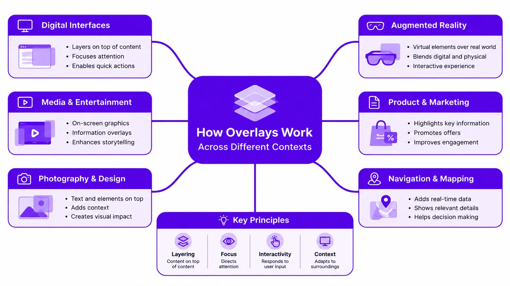
In video and UI design, an overlay is a visual layer rendered above primary content. It may contain text, graphics, motion, or controls. The renderer combines the layers through pixel-level compositing. An opaque part of the upper layer covers what lies below, while a partially transparent part blends with the base.
Transparency and alpha channels make this relationship flexible. A creator can export a logo animation with a transparent background and place it over gameplay, a talking-head shot, or a screen recording without cutting a hole into the original footage. The same principle supports captions, branded frames, contextual labels, and calls to action.
GIS uses a different kind of overlay relationship. A map can contain roads, property boundaries, flood zones, transit routes, or land-use information. Superimposing those layers lets analysts compare their relationships and create an output that answers a spatial question.
The result isn't necessarily a visible effect. It can be a new dataset or an analytical finding. This is why “an overlay is a relationship between layers” is more precise than “an overlay is a transparent graphic.”
Networking applies the idea to infrastructure. An overlay network is a logical network built over a physical underlay, with its own nodes, addressing, and virtual links. Tunneling carries packets through the underlay. An inner header is interpreted by overlay endpoints, while an outer header guides the packet through the physical network, according to the IEEE overview of overlay networks.
This approach lets operators add segmentation, policy controls, or new communication patterns without rebuilding the physical hardware. The tradeoff is extra encapsulation and more operational complexity because tunnel endpoints must wrap and unwrap packets.
The creator's lesson is simple. In every context, the upper layer extends or changes the function of the base layer. Video adds meaning, maps reveal relationships, interfaces add interaction, and networks add logical structure.
Creators usually meet overlays in three places: edited video, live streaming scenes, and recorded tutorials. The mechanics are similar, but the viewer's needs differ.
A YouTube tutorial might use a small logo in the corner, a highlighted cursor, a caption for a key term, and a callout pointing toward a setting. A podcast video might use a lower third to identify a guest. A live gaming scene may combine gameplay, a face camera, recent follower alerts, chat, and a sponsor mark.
Start with the job, not the animation.
A transparent asset works well when you need the base footage to remain visible. A semi-transparent panel can create contrast behind text without completely hiding the scene. An opaque box may be appropriate for a dense instruction, but it should occupy only the area needed for that instruction.
A streaming layout becomes confusing when every element has equal visual weight. Give the gameplay or conversation the largest area, keep supporting elements in predictable positions, and reserve animation for events that deserve attention.
For example, a new follower alert can appear briefly near a designated edge rather than covering the center of the game. A face camera can remain visible without competing with subtitles or a donation notification. Scene templates help, but they should leave enough flexibility for different content types.
A good stream overlay feels like a control panel. It gives viewers useful information without asking them to decode the interface before they can enjoy the broadcast.
Preview the composite, not just the asset. A caption that looks balanced on a transparent canvas may disappear against bright gameplay. A white logo may look clean over a dark intro and become unreadable when placed over a pale background.
A long-form YouTube video and a vertical short don't offer the same base layer. The frame changes shape, the viewer holds the screen closer, and platform controls may occupy parts of the composition. An overlay designed for widescreen footage can become clipped, cramped, or hidden when reused without adjustment.
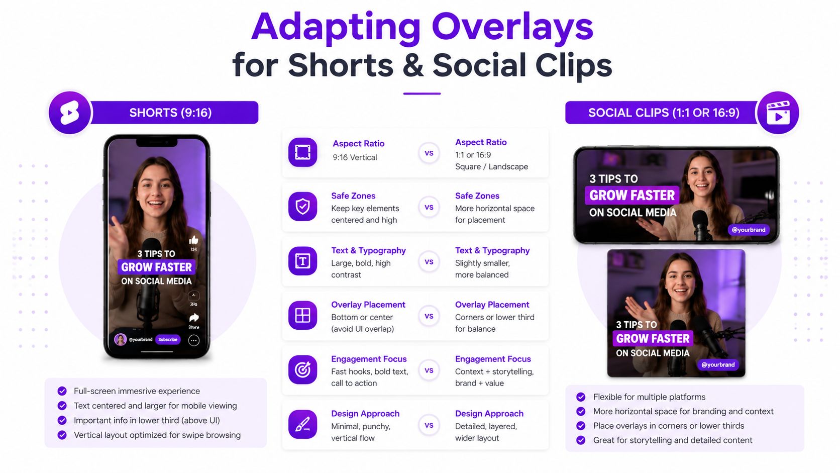
For content, a lower third can sit comfortably near the bottom because the frame provides horizontal room. In vertical content, the same element may collide with captions, account information, or action controls. A short also benefits from faster comprehension, so the overlay needs to communicate with fewer words and stronger hierarchy.
| Content format | Overlay priority | Design response |
|---|---|---|
| Long-form YouTube | Context and navigation | Use lower thirds, chapter cues, diagrams, and occasional calls to action |
| Vertical Shorts | Immediate comprehension | Use bold captions, compact labels, and clear subject framing |
| Reels and TikToks | Mobile readability and native feel | Keep text away from interface areas and simplify decorative elements |
| Repurposed clips | Recognition across channels | Retain brand cues while changing placement and scale |
Branding should adapt too. A small corner logo may work in a full-width video but vanish in a cropped clip. A large persistent watermark may remain visible but distract from the speaker. Create variants rather than forcing one master overlay into every export.
Ask three questions:
If the answer is no to all three, remove it. Short-form editing already places heavy demands on attention. Extra stickers, glowing borders, animated icons, and redundant text can turn a clear clip into visual noise.
A useful short may need only captions and one contextual label. A product demonstration may need an arrow and a brief benefit statement. A reaction clip may need no overlay beyond captions. The right choice depends on the relationship between the layer and the moment, not on a fixed template.
You can create overlays in tools such as Canva, Figma, Adobe After Effects, Adobe Premiere Pro, DaVinci Resolve, or the graphics editor built into your streaming software. Choose the tool based on the asset. A static frame needs a different workflow from a looping alert or a caption animation.
For still graphics, PNG files with transparency are practical because they preserve clean edges around logos, shapes, and text. Animated overlays may use a video format that supports transparency, or they can be composited directly inside the editing or streaming application. The important requirement is that the exported asset retains the separation between the overlay and the base footage.
Build a small asset system rather than a single giant template:
Keep editable text separate from decorative elements. That makes it easier to change a guest name, update a call to action, or move the layer for a vertical export.
Export a test and review it on a phone, desktop monitor, and bright room if possible. Look for thin fonts, weak contrast, clipped text, and edges that shimmer during motion. Confirm that captions don't cover a speaker's mouth, a product detail, or an important interface control.
Accessibility belongs in the design stage. Use sufficient contrast, avoid relying on color alone, keep motion controlled, and make spoken information available as text. A viewer using a screen reader may not perceive a graphic overlay at all, so important meaning should also exist in surrounding text or accessible interface content.
For channel identity, a watermark can be useful when applied with restraint. Learn how creators use a watermark for YouTube videos, then test whether yours supports recognition without turning every frame into an advertisement.
The most common overlay mistakes come from treating every layer as equally important. A creator adds a logo, border, captions, social handle, animated prompt, sponsor mark, and alert because each item seems reasonable alone. Together, they compete with the content.
An overcrowded lower third usually needs fewer words, not a smaller font. A caption covering the speaker's face needs a new position or a different crop, not a stronger shadow. A border that fights with platform controls may need to disappear on social exports.
| Problem | Why it weakens the video | Better correction |
|---|---|---|
| Too many persistent elements | The viewer can't identify the main focal point | Keep only layers that serve the current scene |
| Captions over important visuals | The text blocks the evidence or expression | Reposition, resize, or change the crop |
| Platform UI collisions | Controls obscure the message | Build platform-specific safe areas |
| Constant animation | Movement pulls attention from speech or action | Animate only entrances, exits, or meaningful events |
| Identical templates everywhere | Content feels copied instead of native | Keep brand cues, then vary layout by format |
Consistency still matters for solopreneurs, local service providers, educators, and small teams. Repeated typography, color, and spacing can help viewers recognize a channel and understand its content quickly. Consistency doesn't mean every video needs the same frame or identical motion.
Watch the first export without pausing. Notice where your eyes go before you read the intended message. Then watch it muted and check whether the captions carry the necessary meaning. Review it on a phone, because a polished desktop composition can feel crowded at mobile scale.
A border can frame a clip, but it shouldn't become the subject. For examples of how borders affect video composition, see borders for video.
Audience test: If a viewer notices the overlay before noticing the point, the hierarchy probably needs work.
Templates should speed decisions, not eliminate judgment. Change the overlay when the scene changes. A serious interview, a fast tutorial, and a humorous short can share brand language while using different density, motion, and placement.
Repurposing becomes easier when overlays are reusable components instead of decorations added during the final edit. A long-form recording can provide the base footage, while caption styles, speaker labels, branded frames, and platform-specific callouts turn selected moments into distinct assets.
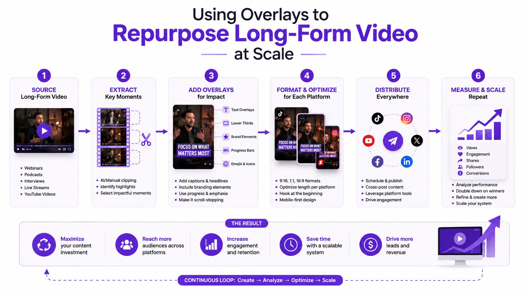
A practical workflow might begin with one recorded interview or tutorial. First, mark moments that stand alone. Next, create a vertical crop for each moment, move the speaker into a clear position, and apply a caption variant that fits the new frame. Add a concise context label where the clip would otherwise confuse someone who never saw the full recording.
The following assets shouldn't all look identical:
The same component library can also support thumbnail variants, social posts, and channel graphics. That separation protects the base recording while letting each platform receive a composition suited to its own viewing environment.
Taja AI is one option for this workflow. Its platform analyzes long-form video and can generate shorts, clips, captions, thumbnails, blogs, and platform-specific posts, with an editor and brand templates for polishing and distribution.
The central principle remains unchanged: each overlay should form a useful relationship with the clip beneath it. When that relationship is planned once and adapted carefully, repurposing takes less repetitive editing and produces content that feels intentional rather than copied.
Taja AI helps turn long-form recordings into ready-to-publish shorts, clips, captions, thumbnails, and platform-specific posts with reusable brand templates. Upload your next video to Taja AI and build overlay variations that fit each channel instead of forcing one edit everywhere.


We are blessed to work with leading brands & Companies


We try to make easy and simple for every professionals. Get 30 days free trial - No credit card required.


© 2025 Taja AI. All rights reserved.