How to Get Views on YouTube Short in 2026
Learn how to get views on YouTube short with hooks, 9:16 cuts, titles, and a simple analytics check that shows what to fix.
5 min read
November 1, 2026

A thumbnail generator for YouTube builds click-ready frames. See 2026 sizes, template vs custom rules, and watch-time tests.
Written by:


More than 90% of the sampled crime-news thumbnails included human faces, according to a content analysis described in a 2025 study of thumbnail design. That's a striking reminder that a thumbnail is a shop window, but a face alone doesn't make the right promise. A useful YouTube thumbnail generator helps you make that promise clear, then lets you judge whether viewers stayed for what they clicked.
You're scrolling a phone feed. One image shows a recognizable face, a clear subject, and a few words you can read without stopping. Another is a jumble of tiny details. You decide which video looks worth opening before you've heard a word.
A YouTube thumbnail generator helps create that first impression from a video, a still frame, or a short creative brief. Think of it as a shop-window dresser who knows what a passerby needs to see: the subject, the promise, and enough visual contrast to stand out without disguising what's inside.
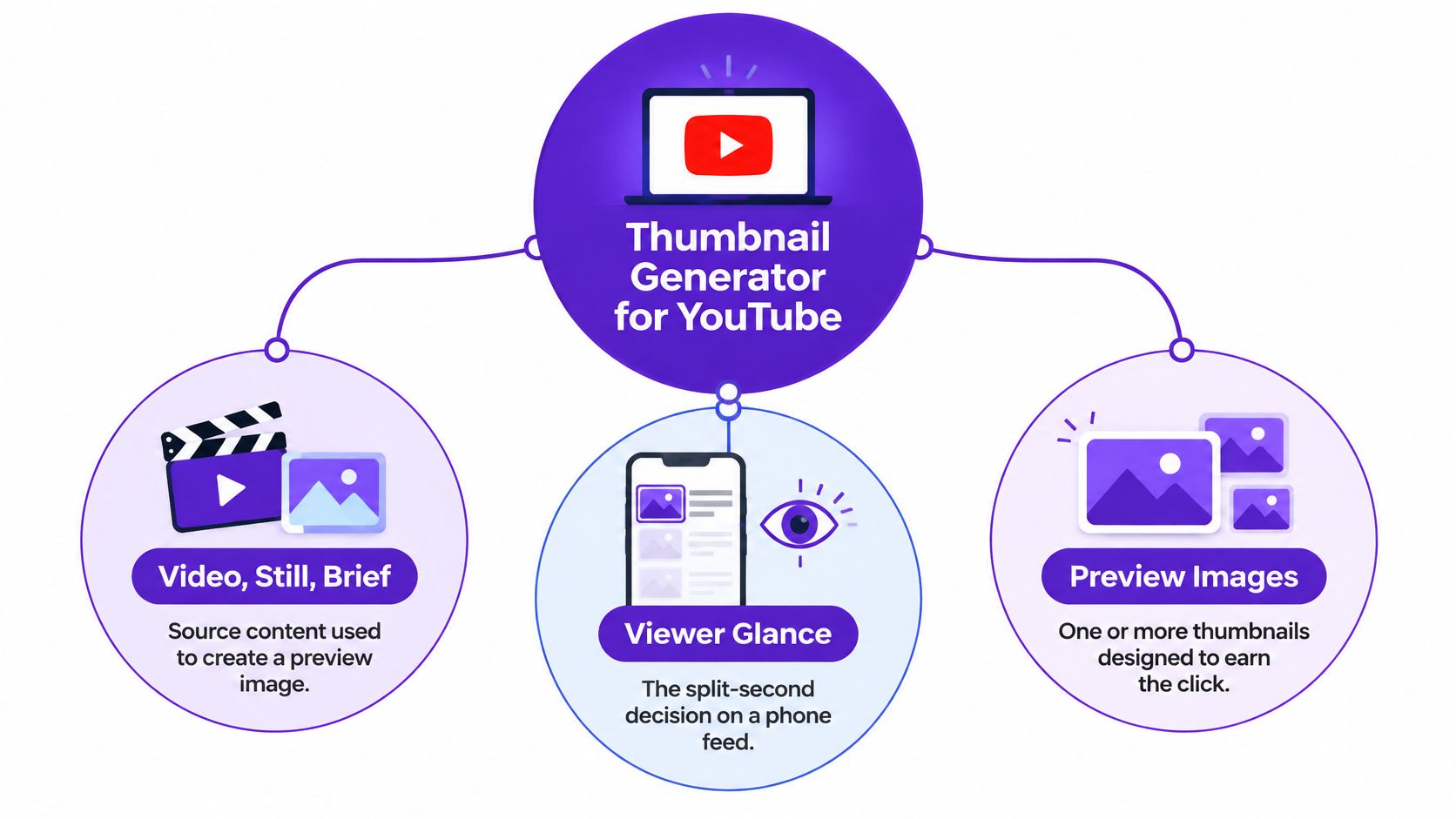
That's not purely a matter of taste. A 2020 study of 3,745 YouTube marketing videos from 38 major brands examined how thumbnail information and visual qualities related to view-through. The same source describes a separate study using 1,118 videos, which associated professionally selected thumbnails with visual measures such as sharpness and texture. The practical lesson is simple: a tool should help you find a relevant, recognizable, well-composed image, not just a loud one.
A generator can produce several layouts quickly, make a still from your footage easier to use, and help keep recurring designs consistent. It can also create a standard-video version and a vertical Shorts version from the same creative direction.
But automation doesn't know whether an expression fits the story unless you check it. A dramatic face can misrepresent a calm tutorial; a polished layout can drift away from your channel's identity if you never lock down its colors and type. Treat each output as a candidate, not a finished decision.
A good thumbnail earns attention by making the video's real subject easier to recognize.
Before you accept a design, ask whether a viewer could connect it to the actual content. If the thumbnail's promise and the video's substance don't line up, revise the image or the words. For a wider view of how the preview works alongside other signals, use this guide to YouTube ranking factors.
| Preset | Pixels | Ratio | File cap | Use it when |
|---|---|---|---|---|
| Standard master | 3840×2160 | 16:9 | Up to 50 MB on desktop | You want a sharp source file; stay at least 640 px wide |
| Everyday standard upload | 1280×720 | 16:9 | 2 MB on mobile | You're uploading the working thumbnail most creators ship |
| YouTube Shorts | 2160×3840 | 9:16 | 2 MB mobile or 50 MB desktop | The video is vertical and needs its own canvas |
| Photo frame | JPEG | 16:9 or 9:16 | Under the device cap | The image is a face, place, or product photo |
| Flat graphic or type | PNG | 16:9 or 9:16 | Under the device cap | You need crisp letters, flat color, or transparency |
| Shorts safe zone | Central 4:5 area inside 9:16 | 4:5 crop risk | Same as the Shorts file | Home, Explore, or subscriptions may auto-crop the vertical frame |
Use these as export presets, not as an invitation to stretch one design into every shape. YouTube's thumbnail guidance recommends 3840×2160 pixels for standard-video thumbnails and 2160×3840 for Shorts, with aspect ratios of 16:9 and 9:16. Standard-video thumbnails should be at least 640 pixels wide.
The upload limit depends on how you send the file. YouTube limits mobile uploads to 2 MB and permits up to 50 MB for desktop uploads. A high-resolution master gives you a clean source; the compressed upload version has to fit the applicable cap without smearing facial details or turning letters soft.
For a photographic frame, JPEG is often a practical export because it compresses photographs efficiently. Choose PNG when the thumbnail relies on flat colors, transparency, or sharp typography. Either way, check the actual exported file, not just the design canvas.
Shorts need special care after export. YouTube may substitute an automatically generated 4:5 thumbnail on Home, Explore, and subscription surfaces. Keep the key face, product, or title toward the center, where a crop is less likely to cut away the subject.
If you need a quick reference to compare common dimensions and ratios, find the right YouTube thumbnail size before saving your tool's presets.
A simple workflow is to save a high-resolution master and a compressed upload copy. Preview the copy at the size viewers are likely to see, then adjust the text or subject position if the small version loses clarity.
A thumbnail can attract attention and still leave viewers disappointed. Design the image to be noticed, but make sure it tells the truth about the video.
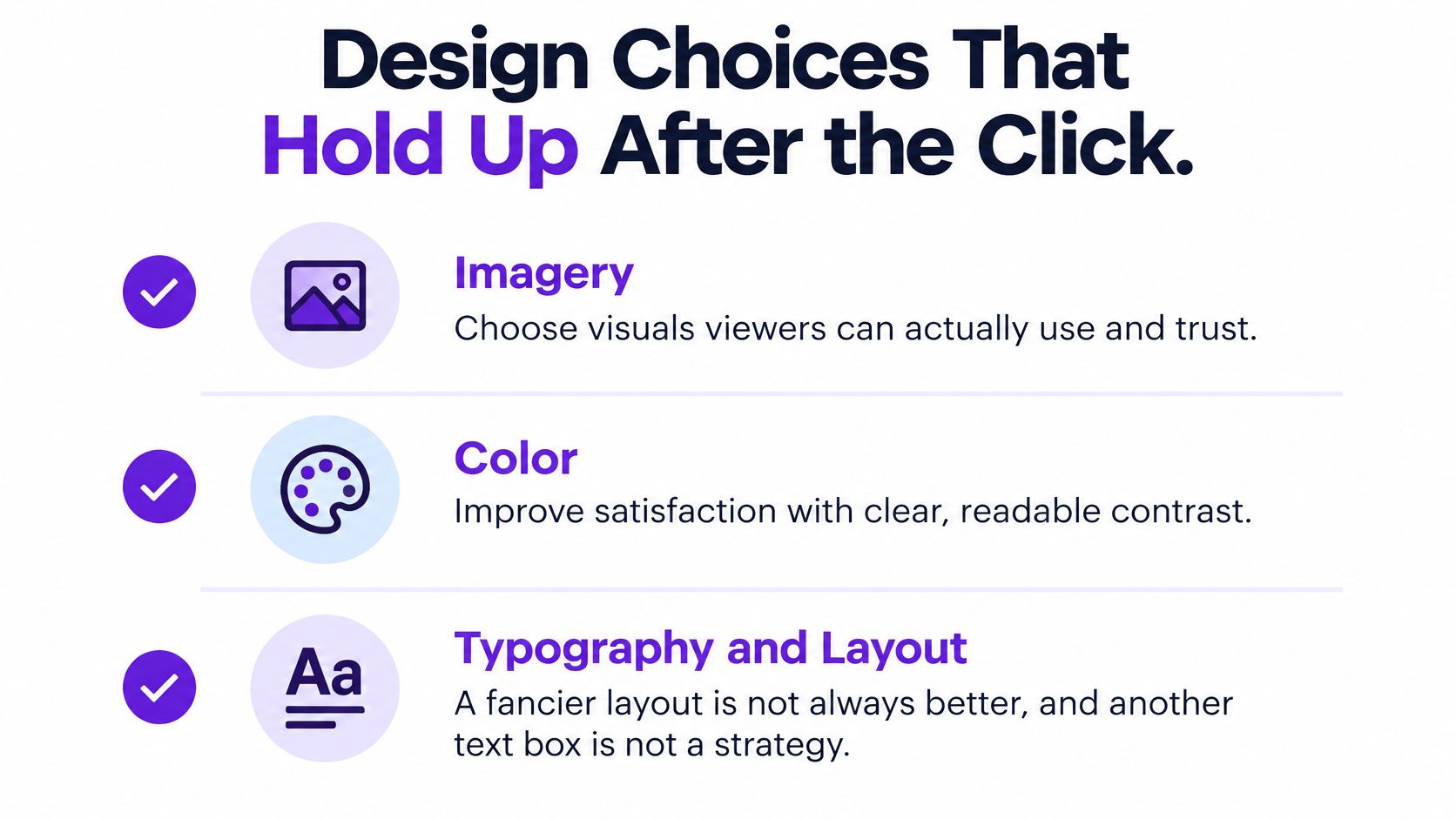
A 2024 Journal of Web Engineering study reported that imagery and typography influenced viewers' attitudes toward videos, while images and color positively affected satisfaction-related evaluations of YouTube thumbnails. Its findings also caution against assuming that elaborate layout or extra text will automatically improve satisfaction. A second box of words isn't a strategy by itself.
Faces can help viewers read emotion quickly. But the same study's report of faces in more than 90% of sampled crime-news thumbnails doesn't mean every creator should paste a shocked expression onto every topic. A person's face should match the subject and tone. For a quiet spreadsheet lesson, a focused expression and a visible chart may say more than an exaggerated gasp.
A thumbnail has two jobs at once, to say what the video contains and to earn the tap, and neither job survives a lie.
Start with one subject. Add a short phrase only if it clarifies the visual rather than repeating the title. Give the face or object room around it, and remove decorative details that become clutter at small sizes.
Color should separate the subject from its background and make any lettering easy to distinguish. Don't assume that more colors mean more attention. If the frame feels busy, simplify the background before adding another graphic or label.
Use these checks before you approve a generated option:
If one answer is no, regenerate or edit the design before uploading. For more starting points, explore these thumbnail ideas for YouTube, then adapt the concept to the specific video rather than copying a generic expression or layout.
A generator earns its place when it gives you distinct options you can evaluate, not one polished image you're tempted to accept without question. Build each version around a different, truthful reason a viewer might want to watch.
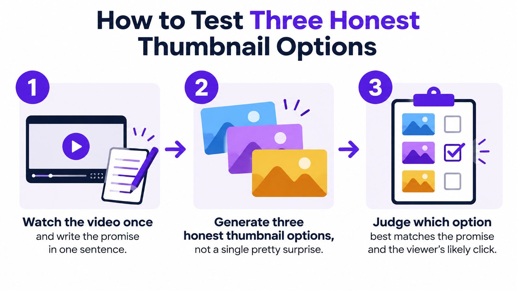
Write the promise. Watch the video and describe its real benefit in one sentence. Keep out any tease the footage can't deliver. “Learn a simple way to compare home prices” is clearer than implying a guaranteed result the lesson doesn't establish.
Choose three concepts. Pick a person, a concrete outcome, and the main object or setting. For a cooking lesson, those might be the cook, the finished dish, and the key ingredient.
Generate one option per concept. Make each design test a different reason to click. Don't produce three near-identical versions that change only the background color.
Write down the expectation. Before judging the visual polish, state what a viewer would think the video contains. If that expectation isn't true, the thumbnail doesn't pass.
Export for the video shape. Use a 16:9 file for a standard video and a 9:16 file for a vertical cut. Check that each option still communicates its subject after export.
Run YouTube's native test. YouTube's title and thumbnail experiment evaluates up to three title and thumbnail combinations and selects the version that performs best by overall watch time. That makes the test about more than which image attracts the most initial clicks.
This approach matters for educators, podcasters, real-estate professionals, and local businesses. A misleading hook can damage trust even when the initial click looks encouraging. Follow YouTube's Community Guidelines, and choose a thumbnail that brings out the best of what the video contains.
To inspect how a candidate appears in a feed before publishing, use this YouTube thumbnail preview. The decision rule stays straightforward: watch time and an honest promise matter more than raw clicks alone.
Say a tutor records a lesson about pricing a home. The video teaches a practical method, not a secret that will suddenly double someone's commissions. That promise gives the tutor a clear standard for judging each generated concept.
The tutor creates three options. One shows their face with the words “Fair price.” Another features the worksheet result, showing the range the lesson really calculates. The third uses a text-light photo of a house, giving the image a clear subject without requiring viewers to read a headline.
The worksheet version seems most informative at full size, but the key test comes after export. The YouTube Data API thumbnail reference lists representations at 320×180, 480×360, and 1280×720 for eligible videos. WCAG 2.2 specifies a minimum contrast ratio of 4.5:1 for normal text and 3:1 for large text in images of text. Those thresholds help the tutor judge whether baked-in words stand out from the background.
At 1280×720, the worksheet's labels are clear. At 320×180, the thin text blurs into the image. The tutor can add a stronger stroke, a shadow, or a solid label behind the words, then export again and inspect the smaller preview. If the lettering still fails, the text-light house image is the better option.
The API reference also notes that eligible thumbnails may appear at 480×360. That's another reason not to approve a design only at its working resolution. Check that the main object and any short headline remain distinguishable at the sizes viewers may encounter.
This is also a useful way to think about visual product tools more broadly: a generated image isn't done until you've checked how it behaves in its intended setting. For example, WearView AI can be a relevant reference when you're exploring AI-generated visuals and want to consider how an image will present its subject.
The tutor exports the photographic option as JPEG and keeps the worksheet design as PNG if its crisp lettering needs it. They publish only the versions that make a promise the lesson keeps. The winner isn't automatically the biggest face or the boldest headline. It's the option that attracts the right viewers and holds their attention.
A template is a repeatable layout: perhaps a fixed logo position, a face or object area, channel colors, and room for a short phrase. It's useful when viewers need to recognize a regular series without relearning its visual style each time.
Custom design is better when the story itself should determine the composition. A product launch, a rare guest, a specific scene, or a before-and-after comparison may need a layout that doesn't fit your usual grid. You can preserve a brand color or type style without forcing the image into a template that hides the subject.
| Situation | Better choice | Change this | Keep locked |
|---|---|---|---|
| Weekly series or podcast | Template | Face, episode cue, or keyword | Colors, logo, and type system |
| Lesson or local listing | Template | Subject and one outcome word | Layout and safe margins |
| Product launch or rare guest | Custom | Composition and hero object | Brand colors only |
| Joke or story that needs a scene | Custom | The specific moment | A short readable label |
| Three-way watch-time test | Template variants | The promise each variant states | Font size and contrast |
| New channel with no look yet | Custom for the first several videos, then a template | Layout experiments | Nothing until a winner repeats |
A weekly podcast can keep its title treatment and colors fixed while changing the guest and episode cue. A local property listing can reuse a layout but swap in the featured home and one accurate outcome phrase. Those templates make related videos feel connected without requiring the same picture every time.
For a story built around a surprising moment, custom design gives the image room to show that scene. A template may still help with a small brand mark or a consistent label, but it shouldn't override the visual that makes the episode distinct. Consistency is useful; sameness isn't.
A new channel can experiment with custom layouts until a visual approach proves repeatable, then turn that approach into a template. Don't lock the design just because the first version looks polished. Keep the elements that help viewers recognize the topic and the channel; change the parts that make each video feel specific.
If your workflow starts with a long-form recording, a tool such as an AI YouTube video generator can help you think about video production as a connected process, rather than treating each visual asset as an isolated task.
Use a generator when you publish regularly, know what the video promises, and want several truthful concepts to compare. Use a custom session when the composition is central to the campaign or relies on a particular moment that a template can't express well. For the middle ground, combine a locked brand template with a generator that can start from a still in your footage.
Taja AI's Thumbnail Generator creates three unique thumbnails with one click, with the option to regenerate more. It can base options on the video topic, the channel's previous best-performing designs, and the niche, and it can use either a still from the video or fully AI-generated imagery. That gives you options to assess, not a reason to skip the promise and legibility checks.
For your next upload, write the video's promise first, generate three visibly different options, and reject any design that implies something the video doesn't deliver. Then test the honest candidates and keep the one that brings viewers who stay.
Taja AI turns a long-form video into ready-to-publish thumbnails and other content, with options you can edit before posting. Replace the automatic frame on your next upload with a few honest alternatives, then visit Taja AI to try a video-based thumbnail workflow.


We are blessed to work with leading brands & Companies


We try to make easy and simple for every professionals. Get 30 days free trial - No credit card required.


© 2025 Taja AI. All rights reserved.