.jpeg)
10 Best Instagram Reels Maker Tools for Creators in 2026
Compare 10 Instagram Reels Maker tools for editing, vertical templates, captions, and publishing, with honest limits and use cases for 2026.
5 min read
October 15, 2026

Discover how a great YouTube thumbnail preview can skyrocket your CTR. Learn to test, optimize, and use AI to create thumbnails that get noticed and clicked.
Written by:


Here's the thing about your YouTube thumbnail: It's the silent salesperson working 24/7 for your video, and most creators are sending it out on the sales floor with its clothes on backwards. That tiny image is your video's entire marketing campaign on the YouTube homepage, in search results, and on those crucial suggested video sidebars.
Getting the preview right is the difference between a video that takes off and one that dies on the launchpad.
Let's be real. That little picture is your video's first impression, and in the fast-scrolling world we live in, it's usually the only one you get. A killer preview isn't just some decorative flair; it's the hook that convinces a viewer to click your video instead of the dozen others surrounding it. Skipping a real preview process is a silent channel killer. It costs you views, subscribers, and momentum.
The impact of a custom thumbnail is just staggering. I've seen the data, and it's wild—videos with well-designed custom thumbnails can get 60–70% higher click-through rates than those using a random, auto-generated still from the video. That’s a massive difference. You can dig into more of those findings on Nearstream.us.
Your thumbnail is not just an image; it's a direct signal to the YouTube algorithm. A higher click-through rate (CTR) tells YouTube that your content is relevant and engaging, prompting the algorithm to show it to a wider audience.
It's not just about grabbing a human eyeball; it's about telling the algorithm that your content is worth promoting.
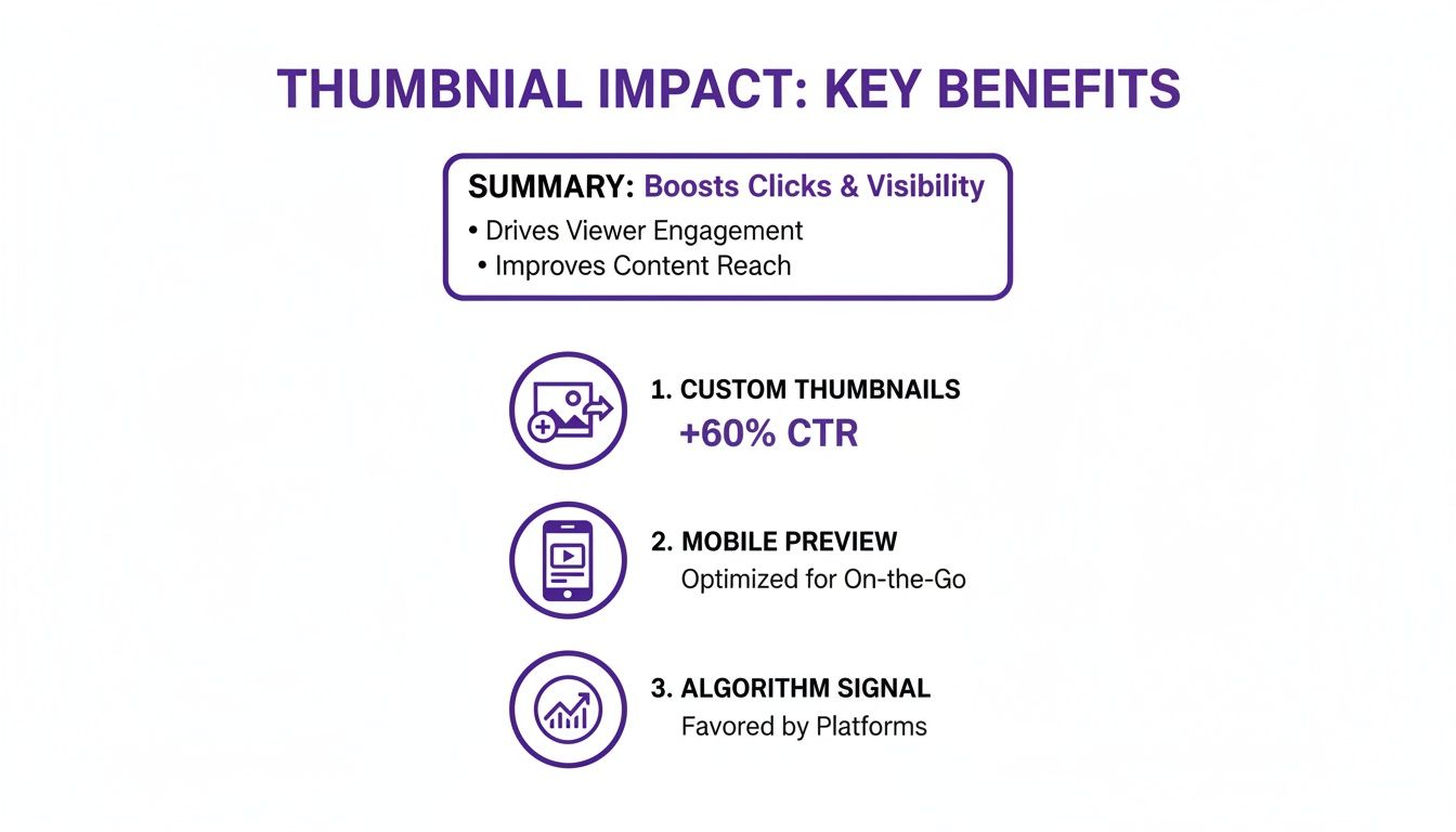
When you nail your custom thumbnail and preview it for mobile, you're not just improving your CTR; you're feeding the algorithm exactly what it wants to see, creating a growth loop for your entire channel.
Here's the mistake I see creators make over and over again. They design a thumbnail in a big, beautiful editor on a 27-inch monitor, think it looks amazing, and upload it without a second thought.
But what looks crisp and clear on your giant screen can turn into an unreadable, blurry smudge on a phone, which is where over 70% of YouTube views happen. You just spent hours creating an amazing video, only to have its packaging fail completely where it matters most.
A bad thumbnail preview leads to a death spiral:
Building the simple habit of checking your thumbnail preview across different contexts can completely change your channel's future. It's about seeing your thumbnail exactly as your audience does—on a tiny mobile feed, in a desktop search list, even on a TV screen—and making sure it packs a punch every single time.
Look, designing a killer thumbnail in your editor is only half the job. A design that looks amazing on your 27-inch monitor can completely fall apart when it’s shrunk down to the size of a postage stamp on a crowded mobile feed.
Before I ever hit "upload," I run every single thumbnail through a few manual checks. It’s a quick, non-negotiable routine that has saved countless videos from being ignored by catching flaws that are totally invisible on a big screen. Don't let a great video die because its packaging fails at the moment of discovery.
Okay, the first check I run is deceptively simple, but it's a total game-changer. It’s what I call the “squint test.” I know it sounds silly, but it works. I just open the thumbnail file, step back a few feet from my monitor, and squint my eyes until the image gets blurry.
Does the main subject—your face, the product, the key visual—still pop? Can you still feel the emotion? If it all just blurs into a confusing mess of colors, you’ve got a problem. A great thumbnail has to communicate a feeling or a question in a split second, and this test tells you if you’ve nailed it.
When a thumbnail passes the squint test, it means you’ve nailed the fundamentals: strong contrast, a clear focal point, and an emotional driver that cuts through all the noise on YouTube.
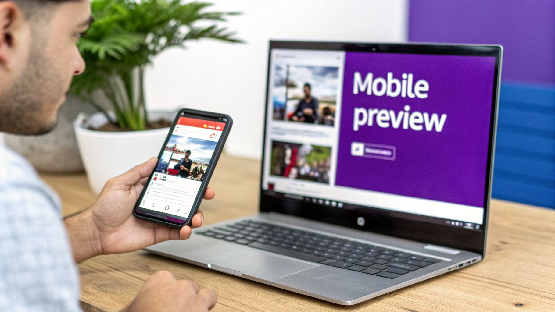
Next up is the most critical preview context: mobile. Since over 70% of YouTube views come from mobile devices, your thumbnail has to win on a small screen. My process here is super simple: I just save the final thumbnail image to my phone.
Once it's on my phone, I run two quick checks:
A design that’s clear and compelling at the size of your thumb will absolutely dominate on any screen. This simple check is the ultimate test of clarity and impact.
Spending time on these manual checks is crucial, which is why speeding up the initial design phase is a huge advantage. Using a YouTube thumbnail generator can give you several strong concepts to start with, letting you pour your energy into testing and refining the best options. This is how you move from guessing what will work to knowing what will get clicks.
You’re still just guessing which thumbnail will perform best, aren't you? It’s okay, most creators are. But what if I told you the days of just "going with your gut" are over? We're now in an era where data doesn't just inform your thumbnail choices—it makes them for you. This isn't about artistic preference anymore; it's about turning your thumbnail into a scientific tool for channel growth.
Honestly, it’s about time. Relying on guesswork is a great way to leave views on the table. Instead, you can lean on proven data-driven design strategies that give you a massive advantage.
Nowhere is this shift more obvious than inside YouTube Studio itself. With the platform’s native ‘Test & Compare’ feature, YouTube is giving us a powerful, albeit slow, way to see what really works.
Here’s the biggest mistake I see creators make: they think A/B testing is all about click-through rate (CTR). Wrong.
YouTube’s own testing tool, which got a major expansion in 2026, doesn't just care about clicks. It's obsessed with watch time share. That means the winning thumbnail isn't necessarily the one that gets the most clicks—it's the one that leads to the highest total watch time.
This is a game-changer. It’s the algorithm’s way of rewarding thumbnails that attract the right audience and set the right expectations, leading to viewers who stick around. Discover more insights about this feature on YouTube's Creator Insider channel.
A thumbnail might get fewer clicks but win the test if its viewers watch significantly longer. This proves it attracted the right audience, which is a powerful signal for long-term channel health.
Think about it. A crazy, clickbaity thumbnail might pull a high CTR, but if viewers bail after 30 seconds because the video didn't deliver, you lose. A simpler, more direct thumbnail might get fewer clicks but attract an audience that watches the whole thing. That’s the one YouTube will reward.
So, what’s the catch with YouTube’s native tool? It’s slow. Waiting up to two weeks for a winner can feel like an eternity when you're trying to refine your strategy.
If you need to iterate faster—and you absolutely should—third-party tools like TubeBuddy or vidIQ are your best friends. These tools often let you run much quicker tests, swapping out thumbnails every 24-48 hours to gather data rapidly.
This kind of rapid-fire testing allows you to:
Look, this isn't just about finding one good thumbnail. It's about building an instinct for what works for your specific audience, backed by real numbers. You take what you learn and apply it to every single video you upload. This is how you turn raw analytics into explosive, predictable growth. You can learn more about using YouTube Studio data in our guide.
A single viral thumbnail can feel like winning the lottery, but let's be honest—that's not a business plan. The real secret to turning random clicks into a loyal audience is a consistent thumbnail strategy. This is where you move beyond just getting a click and start building a brand that people recognize on sight.
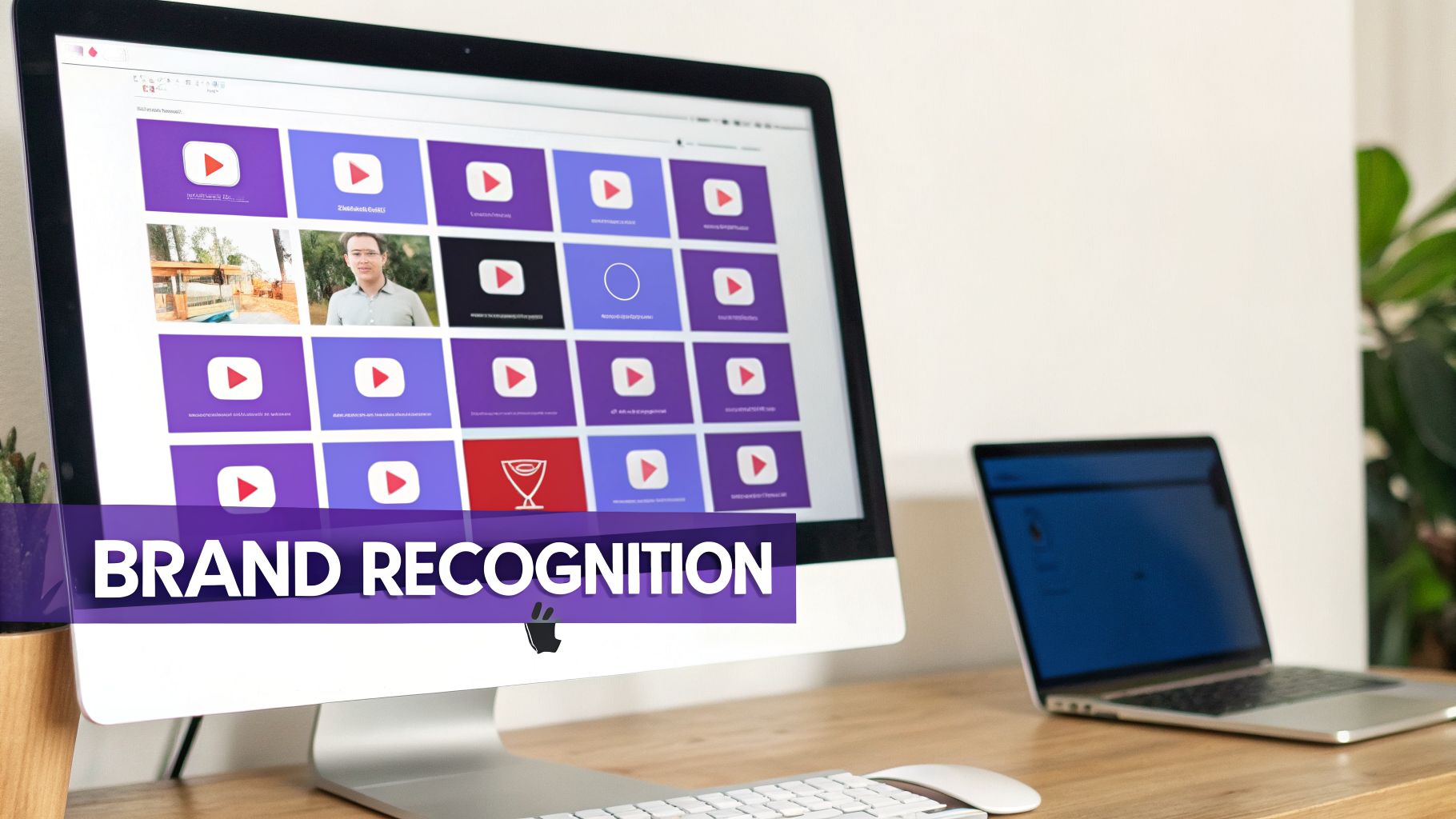
Think about your favorite creators for a second. You can probably spot their videos in a crowded feed before you even read a single word of the title, right? That’s not an accident. They've trained you. They do this by sticking to a consistent visual language—a specific font, a recurring color scheme, or even just the way they position their face.
This isn't just about looking slick and professional. It's a powerful psychological shortcut. When a viewer sees your familiar style, their brain immediately connects it to the value you deliver, making them way more likely to click on your video instead of the ten others surrounding it.
A consistent brand style across your thumbnails doesn't just look professional; it builds trust. It tells viewers that your content is reliable and that you are an authority in your niche.
And the data backs this up. Thumbnails that include brand logos or other consistent branding elements get, on average, 1.2 million more views than those that don't. While YouTube's official recommendation is a 1280 by 720 pixel thumbnail to ensure everything looks crisp, it’s the branding layered on top that really drives repeat viewership. You can dig deeper into the data and best practices for thumbnail specs when you're learning about YouTube's best thumbnail sizes for 2026 and beyond.
Okay, so how do you actually do this without just slapping a giant, obnoxious logo on every single thumbnail? The best branding is subtle. It becomes part of the design itself, not an afterthought.
Here are a few ways to pull it off effectively:
By weaving these elements into every youtube thumbnail preview, you're creating a cohesive, instantly recognizable look that not only helps your videos stand out but reinforces your brand's authority with every single upload.
As a creator, your most valuable asset isn't your camera or your mic; it's your time. And let's be honest, manually brainstorming, designing, and then tweaking multiple thumbnail options for every single video is a direct path to burnout. This is where a smarter workflow isn't just a nice-to-have—it's essential for survival.
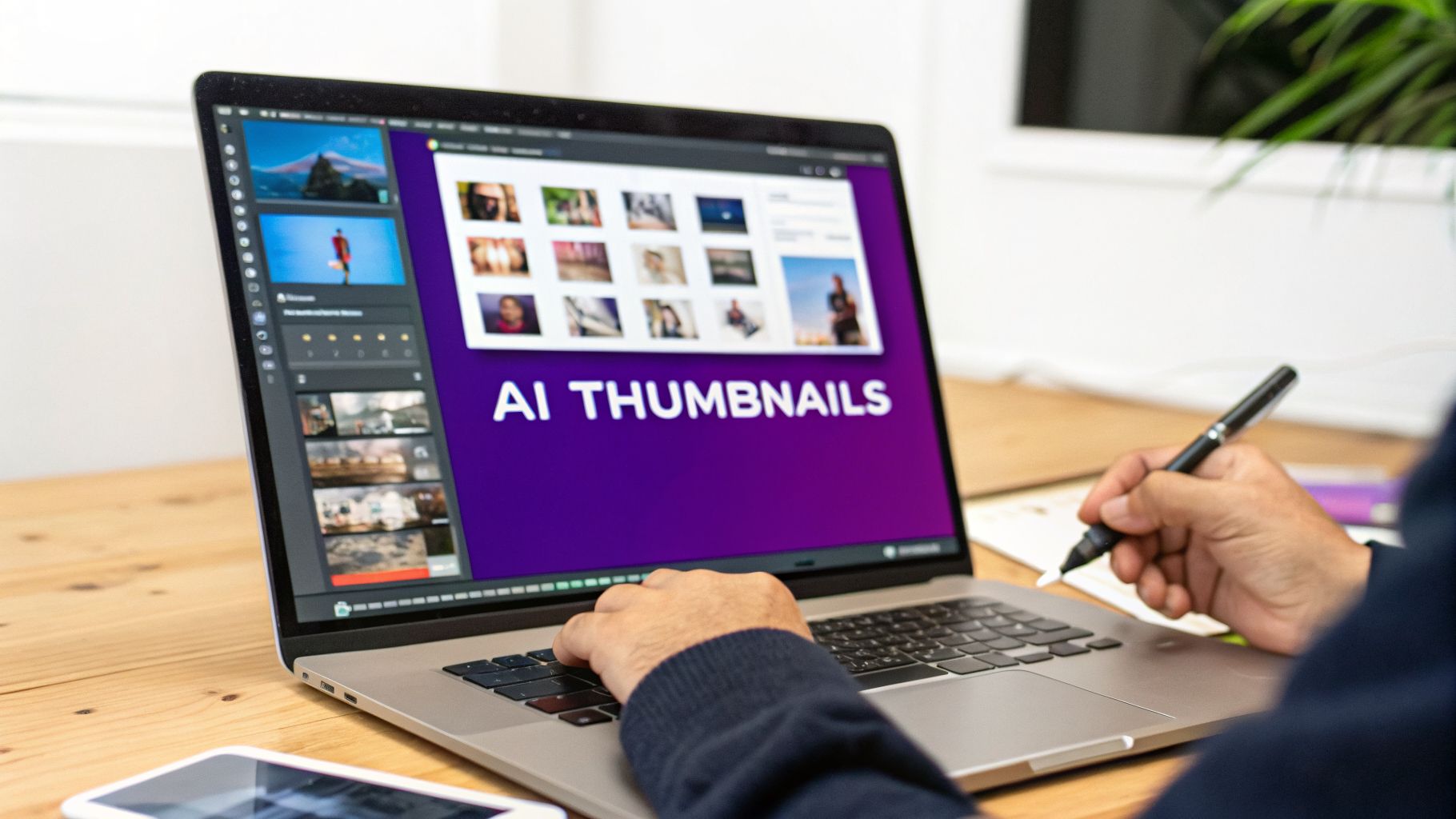
AI tools like Taja AI are built to solve this exact problem. They analyze your video’s content, your established brand identity, and what’s already succeeding in your niche, then automatically generate several high-potential thumbnail concepts. This isn't just about saving a few hours. It's a powerful way to break through creative roadblocks and get solid ideas on the board instantly.
Let me walk you through a real-world scenario. You upload your video to Taja, and within minutes, it spits out five distinct thumbnail options. One of them features a compelling frame from your video with bold, attention-grabbing text you hadn't even considered.
This AI-generated design is now your starting point, not your endpoint. You can take this concept and make a few quick tweaks in an editor—maybe you adjust the text color to better match your brand or crop the image for a tighter focus. To make sure your thumbnails always look crisp and professional, knowing how to upscale YouTube thumbnails is a key part of the process.
From there, you can create multiple variations for A/B testing in a fraction of the time it would have taken to start from a blank canvas. This is the core benefit: letting AI handle the initial heavy lifting so you can focus on the final creative decisions that actually drive clicks.
The screenshot above shows exactly what I'm talking about. AI can generate a variety of thumbnail options, allowing you to maintain brand consistency while testing different visual approaches for each video.
By automating the foundational design, you get your time back to focus on creating more great content. As you can see, AI can revolutionize your YouTube thumbnails in more ways than one.
I get it. You've spent hours designing a thumbnail you think is perfect, only to see it flop once it's live. Getting your youtube thumbnail preview right often comes down to a few practical checks most creators skip. Let's walk through the questions I hear all the time so you can stop making those simple mistakes that kill your click-through rate.
The single most reliable way is to save the final PNG or JPG file to your phone's photo gallery. Don't rely on how it looks on your giant desktop monitor; that's not how your audience sees it.
Once it's on your phone, open the gallery and pinch-to-zoom out until the image is roughly the size of your own thumb. Seriously. This mimics how it will look crammed into the mobile feed, surrounded by a dozen other thumbnails.
If you can't instantly read the text or recognize the core emotion on your face, it's too complicated. Go back to the drawing board.
This one is almost always a resolution problem. You've uploaded a small image, and YouTube is stretching it to fit its standard player dimensions, which makes it look pixelated and unprofessional.
Always, always, always export your final design at 1280x720 pixels. It's also critical to keep the file size under YouTube's 2MB limit. This combination is the sweet spot for maximum clarity without triggering weird compression artifacts.
The answer depends on what tool you're using and how much traffic your channel gets, but here are my go-to rules of thumb:
For any test to be worth a damn, you need at least 1,000 impressions for each thumbnail variation. Anything less, and your results are just statistical noise, not a real indicator of which design is better.
Ready to stop guessing and start creating high-performing thumbnails in minutes? With Taja AI, you can auto-generate multiple data-driven thumbnail options for every video, letting you focus on what you do best—creating amazing content. Try Taja AI for free and see the difference.


We are blessed to work with leading brands & Companies


We try to make easy and simple for every professionals. Get 30 days free trial - No credit card required.


© 2025 Taja AI. All rights reserved.