.jpeg)

How to Share Instagram Reel to TikTok: A 2026 Guide
Learn how to share Instagram Reel to TikTok without the watermark. Our 2026 guide covers saving, audio, captions, and optimizing for both platforms.
5 min read
September 25, 2026

Master the product review format with this 2026 playbook. Get ready-to-use templates, scorecard examples, and SEO tips to write reviews that rank and convert.
Written by:


You know the feeling. The review is half-written, the product details are scattered across tabs, and the structure still feels like a guess. If you publish with the wrong product review format, the piece may look finished but it won't do the two jobs that matter most, earn trust in search and break cleanly into usable social assets later.
That's the problem with most review templates. They stop at intro, pros, cons, verdict, which is enough to hit publish, not enough to build something that compounds across YouTube Shorts, TikTok, Instagram Reels, LinkedIn, and the email list. A strong product review format is a distribution system disguised as an article.
The flatline usually starts the same way. A creator finishes a review, adds a few affiliate links, checks the title one last time, and publishes. Traffic trickles in, then stops, because the piece was built as a single page, not as a reusable content set.
That's why format matters more than polish. A well-written review with the wrong structure can still disappear, while a structurally smart review can keep producing clips, captions, comparison snippets, and thumbnail angles long after the first publish. The difference isn't just style, it's whether each block was designed to stand alone.
Most reviews bury the lead. They open with a vague brand history, a personal anecdote that doesn't clarify who the product is for, or a generic promise to “cover everything.” Readers don't need that. They need an immediate answer to whether the product fits their use case, and they need enough structure to keep scanning.
The stronger approach is to treat the opening like a decision point. A reader should see the product category, the primary benefit, and the reviewer's angle within the first few lines. That same opening then becomes a hook for video, a caption starter, or the first line of a carousel slide.
Practical rule: If the opening can't be clipped into a social caption without rewriting, it's too soft for a modern review.
A review that only works as an article was built too narrowly. The spec summary, hands-on impressions, pros and cons, and verdict should each create a different kind of downstream asset. If that relationship doesn't exist, your article becomes a dead end instead of a source file.
Many templates fail affiliate teams by asking writers to be descriptive, but not modular. That creates long pages that read fine on desktop and collapse the moment the team asks for a 20-second clip, a newsletter excerpt, or a comparison card for LinkedIn. The fix is a format that assumes repurposing from the start.
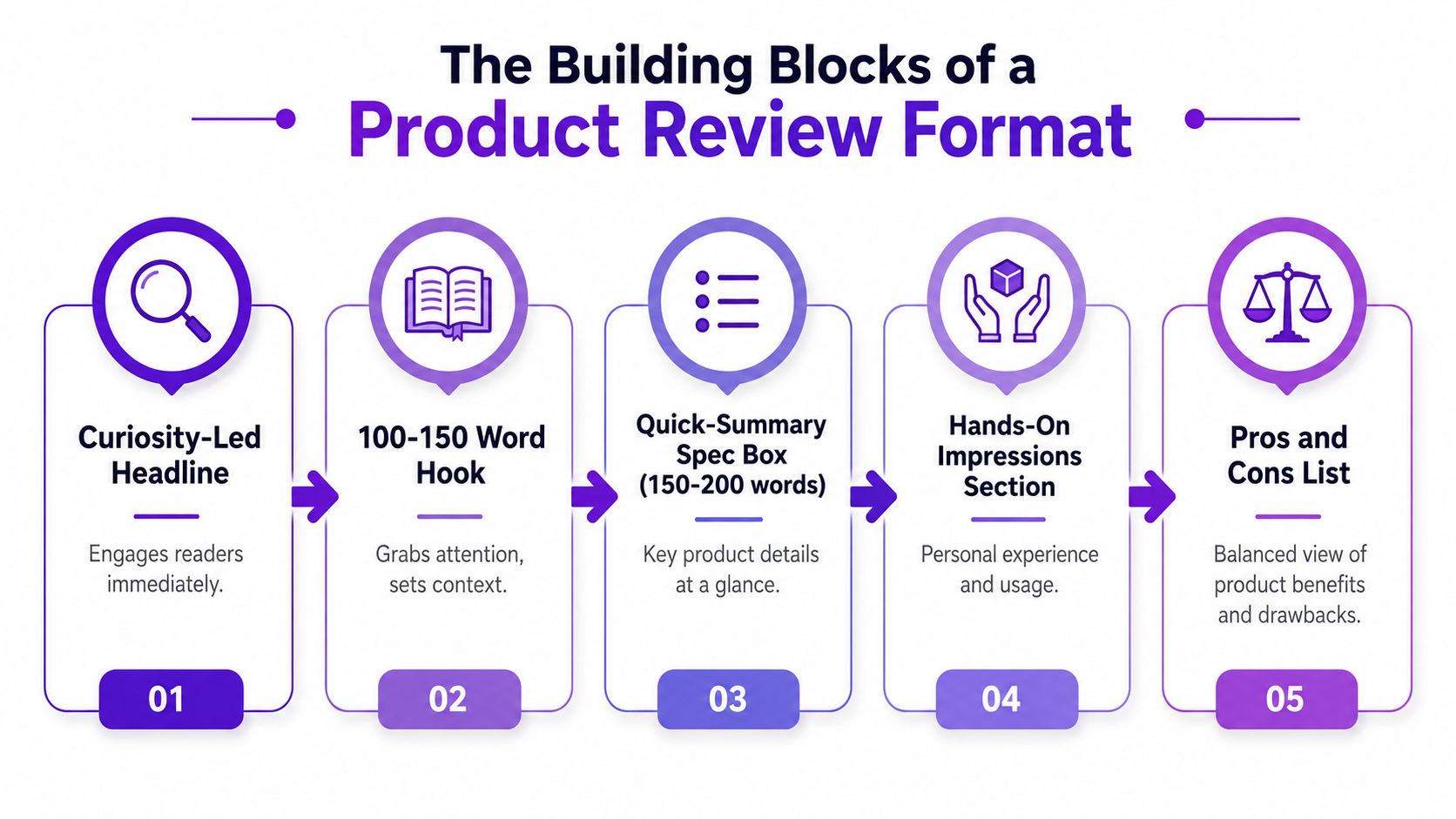
A modern product review format works best when each block has a job. The headline earns the click, the hook earns the skim, the summary serves scanners, and the deeper sections earn trust. When those pieces are arranged on purpose, the article becomes easier to read and easier to repurpose.
Start with a curiosity-led headline that names the product and gives a reason to care. Avoid generic titles like “X Review” if you can make the angle clearer, such as the audience, use case, or strongest limitation. The headline should promise a decision, not just a description.
The hook should run about 100 to 150 words and answer one immediate question, why this product deserves attention now. Keep it specific and grounded in the user's likely intent. That's the paragraph that gets clipped into an intro voice-over, a newsletter blurb, or the first lines of a LinkedIn post.
The quick-summary spec box can run 150 to 200 words and should do one job: help scanners orient fast. Use a compact layout with product type, standout features, and the context a buyer needs. This is the part readers screenshot, and it's often the easiest block to turn into a carousel.
The hands-on impressions section should sit around 300 to 500 words and sound like someone who used the product or rigorously evaluated it. Here, texture matters. Mention setup friction, everyday workflow impact, and the kind of issue a buyer would never learn from a landing page.
The deep-dive feature analysis is the longest section, often 400 to 600 words, because the product either earns the recommendation or doesn't in this part. Cover what each feature solves, where it falls short, and who will feel the gap most sharply. If you need a structure inside the section, organize it by feature cluster instead of by praise.
A review gets stronger when each section answers one question, not when every paragraph tries to do everything at once.
The pros and cons block should stay tight, around 200 to 300 words, and feel balanced. Readers don't trust a wall of praise. They trust a review that admits trade-offs in plain language.
Use a scorecard with weighted criteria when the product needs a more analytical verdict. A scorecard is also one of the easiest parts to reuse in a thumbnail, a social graphic, or a comparison post. End with a final verdict of 100 to 150 words and a contextual call to action that fits the search intent, not a generic “buy now” prompt.
For writers who want a clean external reference point, the guide from Simply Tech Today is useful because it reinforces the same core idea. The format has to help the reader decide, not just fill space.
| Section | Approximate Word Count | Reader Job |
|---|---|---|
| Hook | 100 to 150 | Frames the decision quickly |
| Quick-summary spec box | 150 to 200 | Serves scanners |
| Hands-on impressions | 300 to 500 | Builds trust |
| Deep-dive feature analysis | 400 to 600 | Proves the recommendation |
| Pros and cons | 200 to 300 | Balances the argument |
| Final verdict | 100 to 150 | Closes the decision |
A scorecard works when it feels testable, not theatrical. Readers want to know how the score was built, what mattered most, and whether the criteria match the product's actual use case. That means weighting the categories instead of giving every feature the same importance.
For software and tools, the cleanest scorecard usually includes functionality, performance, usability, reliability, compliance/security, and business value. Those categories cover what buyers care about without turning the review into a product marketing summary. If the product is consumer hardware or a physical item, swap in criteria that reflect the actual purchase decision.
Track your observations while you test. Log bugs with severity and reproduction steps, because vague complaints don't hold up in editorial review or stakeholder review. If a feature failed, note what triggered the failure, what the user saw, and whether it happened once or repeatedly.
A credible scorecard should connect each rating to a measurable outcome when possible. For internal evaluation, that might mean adoption, retention, engagement, error rates, NPS, or revenue impact, depending on the product category and the buyer's goals. The point is to show why a score changed, not just to assign one.
A practical template looks like this:
| Criterion | Weight | Score (1–10) | Evidence / Test |
|---|---|---|---|
| Functionality | 30% | 9 | Core workflows completed without blockers |
| Performance | 20% | 8 | Fast load times during normal use |
| Usability | 20% | 7 | Learning curve was moderate for new users |
| Reliability | 15% | 8 | Stable across repeated sessions |
| Compliance / Security | 5% | 7 | Basic safeguards were visible and documented |
| Business Value | 10% | 9 | Clear fit for the stated workflow |
A half-filled template is better than a fake precision machine. Start with the weights, then fill the evidence column as you test. If a score changes, the reason should be visible in the notes, not hidden in a writer's memory.
For a SaaS review, a clean internal model might read like this:
| Criterion | Weight | Score (1–10) | Evidence / Test |
|---|---|---|---|
| Onboarding | 20% | 8 | Setup completed with minimal support |
| Core feature depth | 25% | 9 | Primary workflows covered well |
| Error handling | 15% | 6 | One repeatable issue appeared during export |
| Collaboration | 15% | 8 | Shared access worked as expected |
| Reporting | 15% | 7 | Reports were usable, but not deeply customizable |
| Value for team use | 10% | 8 | Strong fit for small teams |
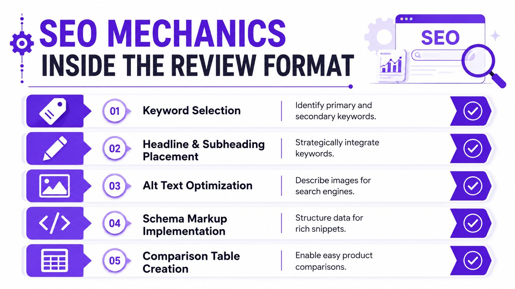
Search performance usually comes down to how well the review matches intent and how clearly it signals trust. That starts with the keyword strategy, but it doesn't end there. A review has to be readable to people, legible to search engines, and clearly built around evidence.
Choose one primary keyword and a small set of supporting terms, then place them where readers expect them. The headline, at least one early subheading, image alt text, and schema markup all matter because they help the page communicate topic and structure. What doesn't work is stuffing the phrase into every paragraph until the copy sounds mechanical.
A comparison table can also support discovery because it makes the page easier to scan and easier to quote. The UX research in the article from Smashing Magazine shows that shoppers don't rely on a star score alone. They respond better when the decimal average score and total number of reviews appear together, along with a full ratings distribution chart and user photos, and Baymard treats ratings distribution as a distinct UX requirement because readers need to see whether the average reflects broad agreement or a polarized set of ratings. That's not just a design preference. It's a trust mechanic. product reviews and ratings UX research
An author bio, a visible disclosure line, clear photo provenance, and a last-updated date all help the page feel maintained instead of abandoned. These details don't just satisfy careful readers, they reduce the chance that the review looks like a templated affiliate page. If you're using screenshots or original photos, say so plainly.
A concise review structure also supports credibility because it shows the page was built with intent. The Miro product review template recommends a staged process, define the overview and intended users, set weighted criteria, log bugs carefully, and connect the review to quantitative metrics. That same discipline translates well into content, because a review that can be audited is easier to trust than one built from impressions alone. product review template methodology
Trust signal rule: If the page gives buyers information about the review process, it should feel more useful, not more defensive.
For teams optimizing the publishing workflow itself, the internal guide at SEO content optimization tool guidance is useful because it keeps the optimization layer tied to structure instead of isolated keyword tweaks.

A strong review should not sit still after publish. If the product review format is built well, each section gives you a clean extraction point for short-form video, captions, and thumbnails, so one piece of research can keep working across channels without being rewritten from scratch.
The spec box usually turns into a carousel post because it is compact and visual by design. The hands-on impressions section can become a 30-second voice-over clip built around one specific workflow detail, which keeps the clip grounded instead of generic. The pros and cons block often works best as a side-by-side Reel, because contrast gives the viewer a quick reason to keep watching.
The final verdict should usually become the Shorts hook. It already contains the clearest decision statement, so it is the easiest line to lift into on-screen text or a thumbnail headline. The scorecard works well as the thumbnail or lead graphic because readers and viewers read a score almost instantly, even before they process the rest of the review.
Strong short-form assets usually start with a sentence that already lives in the review. You do not need a separate voice for every channel. Pull the sharpest line from the summary, trim it, and shape it to the platform's pacing.
Taja AI users report saving up to 2.3 hours per optimized video and have collectively saved over 2.6 million hours by turning long-form video into short-form assets, captions, thumbnails, and platform-specific posts from a single upload, according to the publisher's own figures at Taja AI. That workflow matters because it turns one review into a batch of publishable outputs instead of a one-off asset.
The internal automation workflow guide matters here because the hard part is not making clips; it is keeping the repurposing process consistent enough that the team uses it.
A Reel needs movement, contrast, and a fast payoff. A LinkedIn carousel needs clarity and a business outcome. A newsletter blurb needs a useful takeaway in a few lines. Do not force one asset to behave the same way everywhere.
The review format should make that possible. If every block can be sliced into a caption, hook, or visual, you are no longer writing a single article. You are building a content engine that can keep feeding different channels from one research pass.
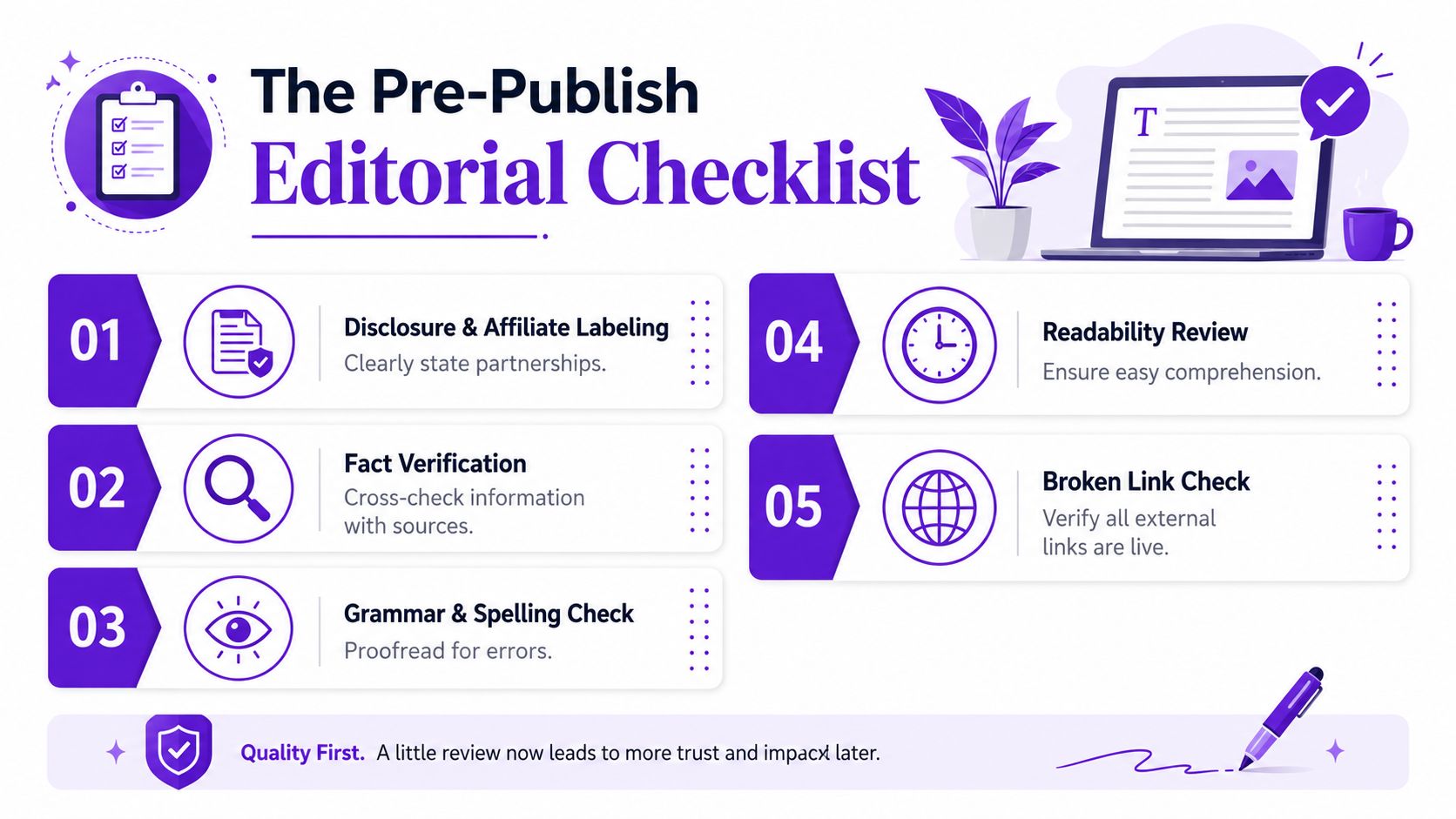
A review can be structurally smart and still fail if the editorial basics are sloppy. This checklist is the fastest way to catch the mistakes that make readers bounce, editors hesitate, or affiliate programs look at the page sideways.
For editorial systems that need a repeatable publishing calendar, the content calendar workflow guide is a good companion because it keeps review production tied to a real cadence instead of a burst of random posts.
Pick one product and score it before you write a single paragraph. Then draft the review in the same order every time, headline, hook, summary box, hands-on impressions, feature analysis, pros and cons, scorecard, verdict, and CTA. That sequence keeps the article readable and gives you clear extraction points for clips and captions later. It also forces the review to serve two jobs at once, a long-form SEO asset on the page and a source of short-form cutdowns for YouTube Shorts, TikTok, and Instagram Reels.
Use the next 30 minutes to lock the weighted criteria and write the headline. That is the part many teams skip, and it is usually why the review drifts into generic territory. Once the title and score framework are set, the rest of the draft gets much easier. You know what the review is proving, what the reader should remember, and which lines can be pulled into a thumbnail or caption without losing context.
A review format only earns its keep when it makes publishing faster without making the piece feel assembled from a template. If the structure is clear, the long version reads like a real buying guide, and the short version can be split into usable assets without extra rewrites. That is the practical test. Build the article so the blog post, the clip script, the caption, and the thumbnail text all come from the same source draft.


We are blessed to work with leading brands & Companies


We try to make easy and simple for every professionals. Get 30 days free trial - No credit card required.


© 2025 Taja AI. All rights reserved.