.jpeg)
How to Share Instagram Reel to TikTok: A 2026 Guide
Learn how to share Instagram Reel to TikTok without the watermark. Our 2026 guide covers saving, audio, captions, and optimizing for both platforms.
5 min read
September 25, 2026

Stop editing from scratch! Use social media video templates to repurpose one video into endless content for TikTok, Reels & Shorts. Get the 2026 guide.
Written by:


66% of consumers find short-form video the most engaging content type on social media, and 73% prefer learning about products through short videos according to Hashmeta's video marketing statistics roundup. That should change how you think about social media video templates.
Most creators still treat templates like decoration. They swap fonts, add a few transitions, and call it a workflow. That's the wrong model. The value of social media video templates is operational. A strong template system turns one long-form recording into a repeatable library of platform-ready clips, each built to publish faster, look consistent, and ask for the right action.
That matters because the bottleneck usually isn't ideas. It's production drag. You record one podcast, webinar, listing walkthrough, sermon, interview, or client Q&A, then lose hours resizing, recutting, captioning, and rebuilding graphics for every channel. Templates remove that rebuild step. Used properly, they become the backbone of a repurposing machine.
Most content teams don't have a creativity problem. They have a systems problem.
The treadmill starts innocently enough. You publish a good video. It gets some traction. Then each platform asks for a slightly different version, a different crop, a different hook, a different caption treatment, a different CTA. By the end of the week, you haven't built a content engine. You've just rebuilt the same asset repeatedly.
That cycle gets worse when your publishing strategy is channel-by-channel instead of source-first. If you plan TikTok separately from Instagram, Instagram separately from YouTube Shorts, and LinkedIn separately from everything else, you guarantee duplicate work. A better approach is to build around the original long-form asset, then push clips through a fixed templated workflow.
A good template doesn't just make videos look cleaner. It reduces decisions.
When your intro animation, lower-third style, caption treatment, CTA card, logo placement, and clip pacing rules are already defined, your editing process moves from invention to assembly. That's where scale happens. Editors work faster. Freelancers stay on-brand. Clients approve faster because the visual language is already familiar.
Practical rule: If you're deciding text style, title placement, and end-screen layout from scratch for every short, you don't have a content workflow yet.
Templates also solve the consistency gap that shows up when multiple people touch the same account. Without a shared system, every post starts looking like it came from a different brand. With a shared system, your feed feels intentional even when the underlying clips come from different long-form videos.
The smartest operators build one pipeline, not four separate publishing habits. That includes your short-form channels and your text-led channels. If LinkedIn is part of your distribution mix, this guide to LinkedIn posting strategy is useful because it reinforces the same idea: consistency improves when distribution follows a repeatable structure rather than daily improvisation.
Templates are that structure for video. They let you move from “What should we post today?” to “Which moments from our core content fit the templates we already know perform?”
That shift saves time, but more significantly, it protects quality while you increase output.
The wrong template creates work. The right one removes it.
A lot of social media video templates look impressive in a marketplace preview and become useless the moment you try to fit them into a real publishing cadence. The issue usually isn't design quality. It's mismatch. A template might be stylish but rigid, packed with effects you won't maintain, or built for a content type you rarely publish.

Start with brand alignment. Your template should support your actual visual identity, not fight it. If your brand uses clean typography and restrained motion, don't adopt a template built around loud transitions and oversized kinetic text. If you already have a documented visual system, map your template decisions to it. Taja's brand style guide template is a useful example of how to define those standards before production starts.
Then assess flexibility, an area where many prebuilt packs often fall short. You want templates that let you quickly swap:
Finally, check content purpose. One template should not carry every job. In practice, most brands need a small stack:
Templates tend to work when they're simple enough to edit quickly and distinctive enough to feel branded.
They usually fail when they rely on novelty alone. Heavy transitions, crowded motion graphics, and hyper-stylized typography often look good in a marketplace demo because they show production flair. In a weekly workflow, they slow your team down and make every clip feel overproduced.
Templates should carry your identity quietly. The clip should still feel like the main event.
A practical benchmark is this: can someone on your team take a new clip, drop it into the template, swap the copy, and export a clean draft without redesigning half the layout? If not, it's not a scalable template. It's a design asset.
A reusable template system breaks the habit of editing the same video three different times.
The goal is not to make one clip that technically fits TikTok, Instagram Reels, and YouTube Shorts. The goal is to create one source edit that can be reshaped fast for each platform without redoing captions, graphics, pacing, and CTAs from scratch. That is what makes repurposing scale.
The master template should hold the decisions that rarely change. Keep your base 9:16 canvas, caption treatment, brand identifiers, and motion behavior in one source file. Then duplicate that file into platform versions with preset adjustments for text placement, pacing, and end-screen layout.
That structure saves time in two places. Editors stop rebuilding design choices on every export, and strategists can test platform-specific hooks without touching the whole visual system.
A practical setup usually includes:
Many weak repurposing systems stop at aspect ratio. That is not enough.
Platform customization matters because audience behavior changes how long a point can breathe, how much text can stay on screen, and where the CTA should appear. A short educational clip might need a tighter opening on Reels, while the same core idea can hold a slightly longer setup on Shorts if the payoff is strong. TikTok often rewards a more immediate pattern interrupt. Shorts can support a cleaner build. Reels usually punish clutter faster than creators expect.
That is why the template should be modular. Build repeatable sections such as:
Editors can then compress, remove, or reorder sections based on the destination platform without breaking the visual flow. This is the difference between a design template and a repurposing system.
Platform UI eats screen space. If captions sit too low, they compete with buttons and descriptions. If title text sits too high, it loses contrast or gets visually crowded by interface elements.
Keep core text in the center-safe area and treat the outer edges as unstable territory. Decorative motion can live closer to the edges. Instructions, subtitles, and CTA copy should not.
If your team publishes to Reels often, this guide to Instagram video format requirements and display behavior is useful for checking placement and sizing before a template goes into regular use.
| Platform | Aspect Ratio | Typical Template Adjustment | Key Safe Zone Notes |
|---|---|---|---|
| TikTok | 9:16 | Faster hook pacing, lighter end-screen reliance | Keep opening text clear of edge clutter and UI competition |
| Instagram Reels | 9:16 | Tighter copy, cleaner layout, shorter text blocks | Leave more breathing room near the bottom overlay area |
| YouTube Shorts | 9:16 | More flexibility for payoff-driven pacing | Protect title text and CTA placement from interface overlap |
The strongest multi-platform workflows keep the message consistent and the packaging flexible. That is how long-form content turns into a repeatable short-form system instead of a weekly editing bottleneck.
Templates save production time. Editing determines whether that time turns into a repeatable growth system or a library of clips that all feel the same.
In repurposing workflows, the template should handle consistency. The edit should handle attention. That distinction matters when one long-form source has to become a week or month of shorts across multiple platforms. If every clip uses the same pacing, same crop, and same motion treatment, viewers start recognizing the pattern before they absorb the idea.
Transform generic templates into unique, engaging content with these key editing details.
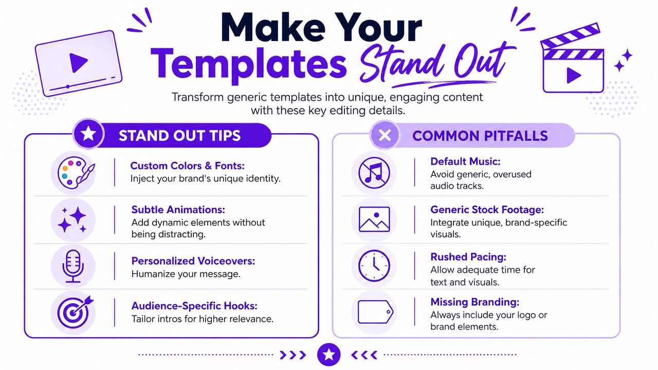
A static talking-head clip inside a polished template still feels static. Motion graphics help, but they rarely fix weak visual pacing on their own.
The better rule is simple. Introduce a visual change early. That can be a tighter crop, a punch-in on a key phrase, a cut to b-roll, a screen recording, a product close-up, or a different camera angle. The goal is not visual chaos. The goal is to signal that the video is progressing.
This is especially important in a repurposing system. One podcast episode, webinar, or interview can produce ten or twenty short clips. Without built-in variation, the whole batch starts to look mass-produced.
High-output teams do not wait for inspiration on every edit. They use rules.
A practical sequence looks like this:
That one rule improves template performance because it adds perceived momentum without forcing a full redesign.
Strong short-form editing changes perspective, not just captions.
Creators who repurpose long-form content at scale usually make the same mistake. They perfect one clip, then rebuild the next one from scratch.
A better workflow is to set editing decisions at the batch level. Choose one caption style, one highlight treatment, one transition speed, and one pattern for visual swaps. Then apply those rules across every cut from the source asset. This keeps the series coherent while still giving each video enough variation to hold attention.
It also makes review faster. Teams can approve a system instead of debating every isolated edit.
Polish usually comes from restraint, not more effects.
If your edit already has strong structure, the next performance lift often comes from the ask at the end. These effective call to action tips are useful for tightening what viewers do after they watch.
The best templates do not stand out because they are flashy. They stand out because they help editors turn one strong source into multiple platform-ready videos without losing pace, clarity, or brand consistency.
A short-form video without a clear next step is usually just a completed edit, not a complete asset.
Most CTAs fail for simple reasons. The wording is vague, the timing is awkward, or the design asks for too much at once. In templated video, the fix is straightforward. Build the CTA as a reusable component, then adapt the wording to the platform and objective.
Ensure your video drives results with these essential CTA design principles.
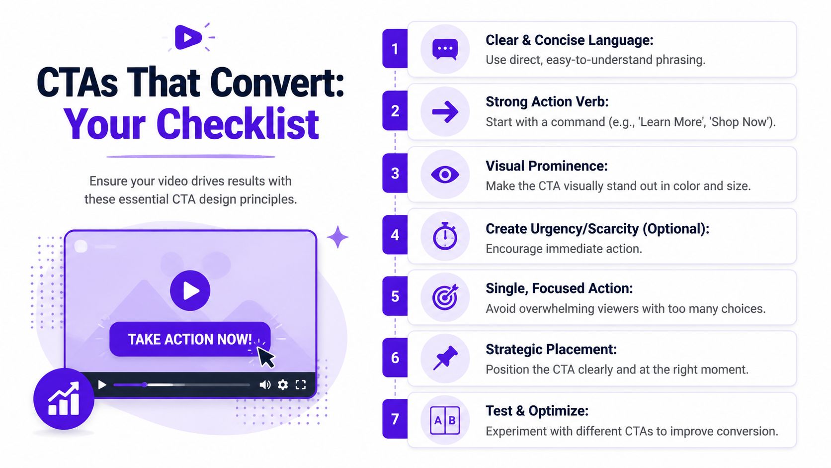
Your template should include a dedicated CTA zone, usually near the end, where text remains legible and uncluttered. That zone should handle one action at a time. “Follow for more,” “Save this,” “Comment a keyword,” and “Visit the link in bio” all have different jobs. Stacking them weakens all of them.
A good CTA module usually includes:
If you want a practical framework for sharpening the language itself, these effective call to action tips are worth reviewing because they focus on clarity over hype.
Repurposing works best when the call to action doesn't feel pasted on. If the long-form source already contains a strong verbal prompt, clip it and keep it. A spoken CTA often feels more trustworthy than a purely graphic end card.
Use the visual CTA card to reinforce the spoken action, not replace it.
Later in the editing sequence, a quick walkthrough can help your team standardize that process:
The design can stay consistent while the wording changes.
For Instagram, “link in bio” often fits the user journey better than an on-screen URL. For YouTube Shorts, it often makes more sense to point viewers toward the description, channel, or related long-form video. For TikTok, engagement CTAs like save, comment, or follow can pair well with clips that invite response.
Conversion check: If someone follows your CTA exactly, is the next step obvious on that platform?
That's the test. A beautiful CTA card that sends viewers into friction won't convert. The template should lower decision-making for the viewer, just like it lowers production effort for your team.
A workable system starts with one strong source asset and ends with a batch of finished outputs. Everything between those points should be as repeatable as possible.
Teams usually struggle with repurposing because they handle every stage manually. They pick clips by hand, reformat each one separately, rewrite captions from scratch, and publish natively on every channel. That process can work for a while, but it doesn't scale cleanly when output expectations increase.
Streamline your content strategy by transforming a single piece of core content into multiple social media assets.
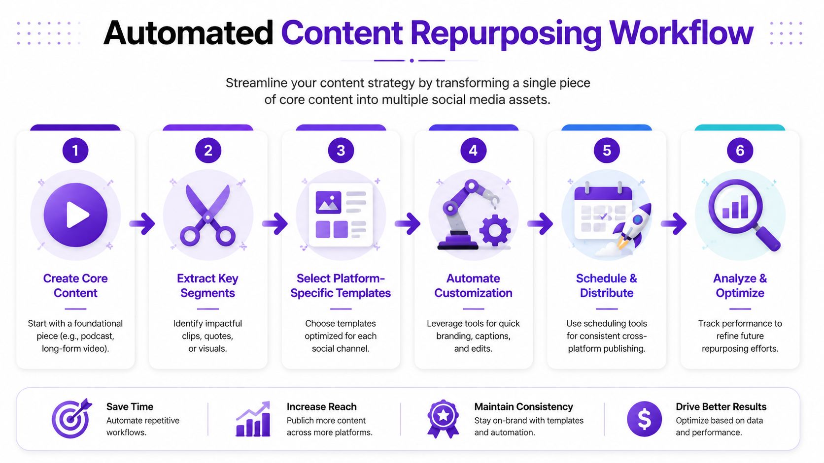
The best repurposing systems follow a simple sequence:
That model works especially well for teams producing educational, testimonial, and commentary-driven content. If you want a broader view of how creative teams build repeatable production systems, this piece on scalable video for creative teams is a useful companion read.
Automation is most valuable in the parts of the workflow that don't benefit from repeated manual effort:
What still needs judgment is message selection. You still need to decide which moments deserve distribution, which clips fit which template family, and which CTA belongs with the clip. Automation should compress execution, not replace editorial taste.
For teams trying to reduce turnaround time, this guide to automating content creation workflows gives a useful operational view of where automation fits without turning the process into low-quality output.
The payoff isn't just speed. It's consistency without daily reinvention. Once your social media video templates, platform variants, editing rules, and CTA modules are all documented, repurposing becomes a production line instead of a scramble.
If you want a faster way to turn long-form recordings into branded shorts, captions, thumbnails, blogs, and scheduled posts, Taja AI is built for that workflow. Upload one video, generate platform-specific assets, apply brand templates, and move from raw content to a full publishing queue without rebuilding each piece by hand.


We are blessed to work with leading brands & Companies


We try to make easy and simple for every professionals. Get 30 days free trial - No credit card required.


© 2025 Taja AI. All rights reserved.