.jpeg)
How to Schedule Instagram Reels: Creator Workflow Guide
Learn how to schedule Instagram Reels using native tools, Meta Business Suite, and AI automation. Master timing, captions, and bulk workflows
5 min read
October 1, 2026

Discover the best aspect ratio for YouTube videos, Shorts, and community posts. Learn when to use 16:9 vs 9:16 with practical tips and real examples.
Written by:


The best aspect ratio for YouTube depends on where you want your video to live. YouTube's standard computer player is 16:9, while vertical and square uploads are supported in the Shorts ecosystem, creating a clear split between widescreen depth and mobile-first discovery. YouTube's own aspect-ratio guidance makes the practical answer simpler than most format guides suggest: use 16:9 for standard long-form videos and 9:16 for Shorts.
That distinction matters because aspect ratio changes more than the shape of your frame. It affects how much screen your video occupies, how viewers encounter it, how easily you can reuse footage, and whether the final upload looks deliberate or like a crop you made five minutes before publishing. I've wasted enough time forcing wide footage into vertical layouts to know that the format needs to be chosen as part of the content strategy, not as an export setting at the end.
16:9 is YouTube's standard aspect ratio for its computer player, but that default does not settle the publishing decision. A detailed tutorial placed in a narrow vertical frame can feel cramped on a laptop. A quick tip exported horizontally can appear small when viewers meet it in a full-screen vertical feed. The idea may be sound, yet the frame creates friction before the viewer has a reason to stay.
That choice affects distribution as well as presentation. A format helps position the video for YouTube's mobile discovery engine or for the deeper viewing environment of long-form content. Choose poorly, and a useful video can end up competing in the wrong context, where its strengths are hard to see.
YouTube adapts videos in other shapes to the viewer's device. YouTube explains how its player handles different video shapes, including added padding for some vertical videos in computer browsers. The player can accommodate the upload, but automatic resizing cannot repair weak framing, unreadable text, or a subject placed outside the crop.
Practical rule: Choose the ratio that matches the viewer's first likely environment, not the camera setting you happened to use.
Long-form content usually needs room for explanation, demonstrations, context, and a steady visual rhythm. Wide framing supports that work by keeping a presenter, screen recording, product, or two-person conversation visible without aggressive cropping. It gives the viewer enough information to understand the subject before the edit asks for attention elsewhere.
A Short has a narrower, faster job. It must communicate quickly while filling the phone screen naturally. Vertical framing gives the subject more presence and reduces the effort required to watch a wide image inside a narrow interface. That difference can affect whether a viewer keeps scrolling or starts watching.
The costly mistake is treating one upload as a universal master file. A horizontal interview may work perfectly as long-form content, while a carefully selected vertical excerpt gives a new viewer a clear entry point. The reverse also happens. A vertical clip can earn attention without providing enough context to show why the channel deserves a longer visit.
Use 16:9 when depth, clarity, and broad device compatibility matter most. Use 9:16 when the idea depends on fast mobile consumption and vertical screen coverage. If both outcomes matter, connect the formats in the publishing plan instead of forcing one version to perform two incompatible jobs.
Make the decision before editing. Late crops often cut off speakers, push text toward the edge, or make screen recordings unreadable. Aspect ratio determines composition, viewer context, and the route a video takes to discovery. Treating it as a planning choice keeps strong content out of the long-form graveyard.
Five common long-form formats benefit from a wide frame. 16:9 is the safest baseline for standard YouTube videos because it fits the platform's default computer player and remains practical on laptops, desktop monitors, televisions, and fullscreen mobile viewing. A presenter can share the frame with supporting visuals, screen recordings, or product details without forcing every element into a cramped composition.
The platform's own player guidance supports treating 16:9 as the dependable starting point for long-form production. Set the frame before filming, rather than trying to rescue a narrow crop after the edit.
A wide-format frame suits:
YouTube recommends 1920 × 1080 for 16:9 uploads and supports a broad range of 16:9 resolutions, from 426 × 240 through 7680 × 4320, according to its official upload encoding recommendations. That range gives editors a clear export path. Match the resolution to the footage and delivery needs instead of treating the highest option as a requirement.
Start with a 16:9 timeline when the finished video belongs on the main long-form channel. Export at a resolution that matches the source footage, then inspect the final file before uploading. Keep captions, logos, and interface controls away from the extreme edges, where different playback layouts can make them difficult to read.
The least-friction choice is usually the right choice for evergreen video. A clean 16:9 master provides a stable source for full-screen viewing, clips, embeds, and future edits.
16:9 also keeps the visual identity consistent. Thumbnails, title cards, chapter screens, and demonstrations can follow one widescreen system. Vertical clips can be extracted later, but the main edit should serve the long-form viewer first. That dual-format discipline protects the original video while creating usable material for discovery.
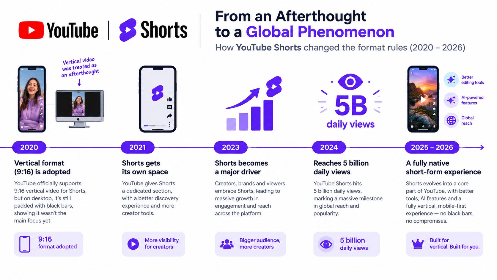
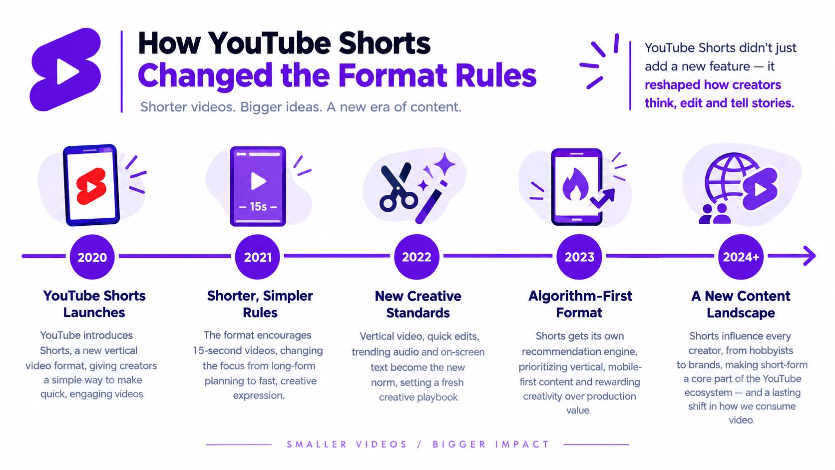
Since 15 October 2024, square and vertical videos up to three minutes can qualify as Shorts under YouTube's current rules. YouTube's Shorts upload guidance also confirms support for vertical and square uploads. That policy changed the strategic role of portrait video. The frame now has a route into YouTube's discovery engine, with viewing behavior and editing expectations built around mobile browsing.
A 9:16 upload works best when the entire experience is designed for a portrait screen. The subject, captions, pacing, and first few seconds all need to make sense during rapid mobile scrolling. A horizontal edit squeezed into a vertical crop often loses the evidence that made the original useful. I have made that mistake, then spent more time repairing the crop than creating a clean native version.
Portrait framing gives one main subject more visual priority. That suits a person speaking to camera, a close-up demonstration, a recipe, a physical product, or text that must remain readable on a small display. It also changes the edit. Captions need enough size and contrast, transitions must survive fast scrolling, and the opening idea has to work without a long introduction.
The format creates a second publishing lane for a channel. Long-form videos can develop a subject, explain the context, and answer deeper questions. Shorts can extract a sharp, self-contained angle that introduces the topic to viewers browsing vertically. The two formats serve different jobs, which helps a channel reach discovery viewers without forcing every idea into a full-length upload.
Creators still building their workflow can use this practical guide on how to create YouTube Shorts. Its central production lesson applies broadly: treat vertical video as its own composition, even when the source footage began in 16:9.
Choose 9:16 when a full-height phone presentation strengthens the story. Use square video when an existing cross-platform workflow calls for it, but a square frame can feel like a compromise on YouTube. For YouTube-first publishing, a dedicated portrait composition usually gives the subject clearer emphasis and fewer distracting empty areas.
The useful question is strategic. Which version should win the first view, which one should carry the deeper explanation, and how can each lead viewers to the other without repeating the same edit? A deliberate pairing keeps vertical content in the discovery engine while giving the original long-form video a clear role. Without that plan, a poorly cropped Short can bury a good idea before the viewer reaches it.
There isn't one universal winner. 16:9 is the stronger default for long-form authority and compatibility, while 9:16 is the stronger native format for Shorts discovery and mobile viewing. The right choice depends on what the viewer needs from the video and what you want the upload to accomplish.
| Format | Best For | Reach Potential | Monetization | Production Effort |
|---|---|---|---|---|
| 16:9 | Tutorials, reviews, interviews, vlogs, educational videos | Broad device compatibility and long-form viewing | Suits deeper content and established channel journeys | Efficient when the source is designed for landscape |
| 9:16 | Shorts, quick demonstrations, reactions, tips, mobile-first storytelling | Strong fit for vertical browsing and discovery | Useful for audience entry, but not a substitute for a complete long-form offer | Requires deliberate reframing, captions, and subject tracking |
| Square | Repurposed social clips and selected cross-platform assets | Supported, but less native to either main viewing context | Depends heavily on the content and distribution path | Convenient for reuse, though often a visual compromise |
The difference becomes obvious during editing. A 16:9 frame can show a presenter beside a screen recording. A 9:16 crop may need to alternate between the presenter and the screen, enlarge the interface, or use a tighter sequence of shots. Neither approach is automatically more engaging. Each asks the editor to solve a different visual problem.
If you publish across several social platforms, it helps to keep a separate reference for each destination. A resource covering Instagram image size best practices can help prevent the common mistake of assuming that a format designed for one feed will transfer cleanly to another.
Choose 16:9 when viewers need to learn, compare, follow a process, or spend time with the subject. Choose 9:16 when the idea can stand on its own as a focused, quickly understood moment. If the source is a conversation, select a quote or exchange that makes sense without all the surrounding discussion.
The commercial role can differ too. A Short may introduce a creator to someone new, while a long-form video may do more work explaining a service, product, or point of view. That doesn't make one format universally better for revenue. It means the formats often occupy different stages of the viewer journey.
A useful comparison of YouTube Shorts and long videos can help you decide whether a particular idea needs a complete long-form treatment, a concise vertical version, or both.
Aspect ratio decides whether an idea can enter YouTube's discovery engine or gets buried after the long-form upload. The practical system is to build one complete video, then create focused vertical cuts from moments that already work.
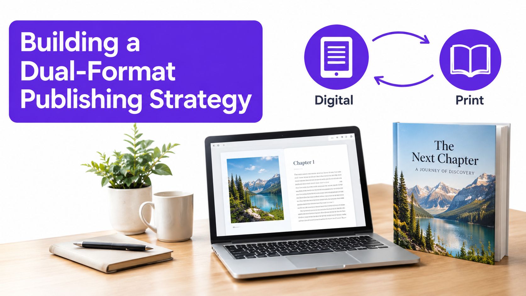
Design the 16:9 master around the full viewer experience. During recording, keep the speaker, product, or demonstration close enough to the center to leave a usable option for a 9:16 crop. Do not flatten every wide composition. Leave a deliberate reframing path instead.
Finish the long-form story first. The complete video should solve the viewer's problem without depending on a Short for missing context.
Mark self-contained moments. Find a surprising answer, useful demonstration, strong opinion, or clear mistake followed by a correction. Each clip needs its own beginning, development, and payoff.
Build a vertical version. Reframe the shot for 9:16, place the subject inside the usable area, enlarge details that became too small, and remove clutter that only made sense in a 16:9 frame.
Add readable captions. Viewers may encounter the clip before audio is available. Captions should reinforce the message without covering the speaker's face or important product details.
Connect the formats without overexplaining. A Short can direct viewers to the complete video, but it still needs to deliver useful information. A teaser with no payoff feels like an advertisement and gives people little reason to continue.
The two formats should share a topic and production source without becoming identical. Long-form provides depth and context. The Short creates a sharp entry point for discovery. Make the relationship clear through the idea, not repeated introductions.
Keep separate project sequences for 16:9 and 9:16. I have lost time by permanently cropping original footage, only to discover that a later edit needed a different subject position or a wider shot. Preserve the original and save captions and graphics as editable layers, so they can be resized instead of rebuilt after export.
Premiere Pro, Final Cut Pro, and CapCut can assist with reframing, but automated cropping still needs human review. Faces move, products leave the center, and screen recordings contain details that generic auto-cropping cannot interpret. Review the finished cut on both a desktop display and a phone before publishing.
A correct aspect ratio does not guarantee a clean upload. Supporting assets, cropping, captions, and audio all need to match the format viewers will see. Check these details before publishing, because a bad crop discovered after release is harder to fix than one caught during review.
Watch the complete video in its intended ratio. Checking only the opening can hide problems that appear when the subject moves or the layout changes. Look for:
Review the opening, the busiest visual moment, and the final call to action on both a laptop and a phone. Those checkpoints reveal whether the crop supports the message or merely cuts around it.
Thumbnails, title cards, captions, and end screens should not move unchanged between long-form videos and Shorts. A horizontal design may shrink into illegibility in a portrait layout. Vertical text can become oversized and distracting on a widescreen player. Create reusable templates with separate placements for each ratio.
If cropping causes the problem, this guide on how to crop videos on YouTube explains how to adjust the edit while keeping the original file intact. Preserve the source, create a format-specific version, and inspect captions and overlays at the size viewers will use.
Audio needs its own check. Viewers often encounter vertical clips while browsing quickly, so the message should remain clear through readable captions, distinct speech, and restrained background music. Keep text away from the speaker's mouth and interface controls. If the caption style attracts more attention than the point, simplify it.
The reliable upload sequence is short: decide the video's role, export the matching ratio, review it on likely devices, then publish. I have saved myself from plenty of embarrassing crops by adding that pause instead of trusting the export preview.
Taja AI can turn long-form video into Shorts and other content assets, reformatting clips to 9:16 and reframing important visual elements to keep them in view. Creators building a dual-format YouTube workflow can visit Taja AI to review that process.


We are blessed to work with leading brands & Companies


We try to make easy and simple for every professionals. Get 30 days free trial - No credit card required.


© 2025 Taja AI. All rights reserved.