10 Facebook Video Best Practices for Creators in 2026
Facebook video best practices for creators: master hooks, specs, captions, distribution, Reels, Stories, boosting, and analytics in 2026.
5 min read
October 22, 2026

Learn how symbols in advertising influence consumer perception and behavior. Our guide explains semiotics, common symbol types, and how to use them effectively.
Written by:


49% of consumers find logos with hidden meanings or symbols more memorable. That should change how you think about creative work.
A symbol isn't just decoration. It's compressed strategy. When you choose the right shape, color cue, mascot, icon, or recurring visual motif, you give people a faster way to recognize your brand, feel something about it, and remember it later.
That matters even more now because attention is short, feeds move fast, and most ads get seen at small sizes, with the sound off, for barely a moment. In that environment, symbols in advertising either do real work or they become visual clutter. There isn't much middle ground.
Symbolism is often treated like a layer added after the main message is done. That's backwards. The symbol often carries the message before anyone reads the copy.
The reason goes back to the roots of modern advertising. The modern era of brand symbolism took shape as mass print advertising expanded in the late 19th and early 20th centuries, when advertisers increasingly used visual symbols to connect products with desired meanings instead of only describing features, as discussed in this historical research on symbolic visuals in advertising. That shift was huge because it moved ads from description to inference. People didn't just see a product. They began to infer status, trust, purity, speed, sophistication, or rebellion from the surrounding imagery.
That same logic still drives modern brand systems. A simple mark can suggest credibility. A repeated color can cue familiarity. A mascot can soften a hard sell. A symbol can do in half a second what a paragraph often can't.
Busy audiences rarely study ads. They scan. They decide fast. Strong symbols help them process what they're seeing without extra effort.
A clean icon system on a thumbnail, storefront sign, package, or social post gives viewers a shortcut. They don't need to decode the whole message from scratch. They recognize the category, the tone, or the promise almost instantly.
Practical rule: If your symbol doesn't clarify meaning faster than text alone, it isn't helping.
That principle shows up clearly in older formats. If you study lessons from classic print advertising, you can see how art direction often carried the selling job before the body copy finished it. The same discipline applies today in shorts, reels, and static creatives.
The best symbols aren't isolated design flourishes. They become reusable assets across touchpoints. Think watermark, thumbnail corner treatment, recurring motion cue, badge, pattern, or character.
That's why even small creators should think beyond logos. A visible, consistent mark can reinforce authorship and recognition across videos, which is one reason a strong brand watermark strategy for YouTube videos matters in practice.
What works is consistency with intent. What fails is random symbolism. If one campaign uses sleek geometric minimalism, another uses rustic heritage cues, and a third uses playful cartoon language, the audience doesn't build a stable mental association. They just see a brand that can't decide what it means.
If "semiotics" sounds academic, simplify it this way. It explains how signs create meaning.
A red traffic light is the easiest example. The signifier is the red light you see. The signified is the idea of stopping or danger. The referent is the actual action in the world, your car staying put at the intersection. Advertising works the same way. A symbol stands in for an idea, then that idea shapes how people interpret the product.
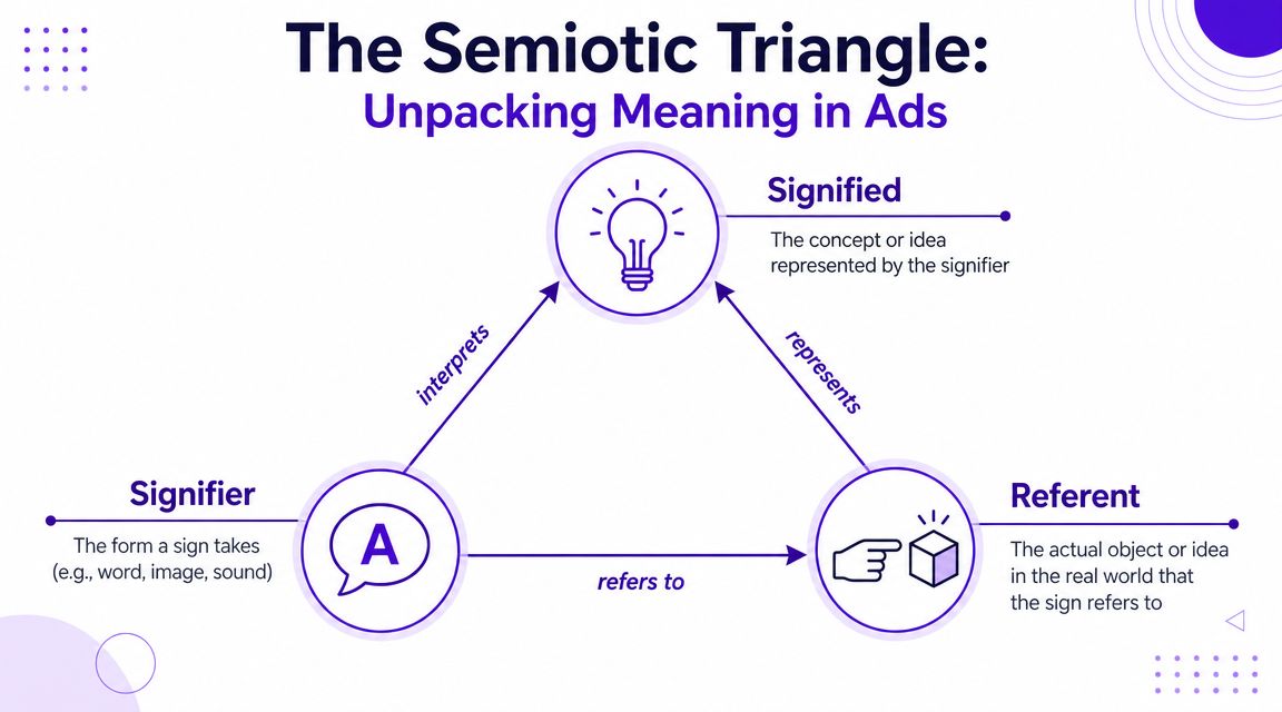
When you look at symbols in advertising, separate the parts.
Good advertising aligns all three. Bad advertising creates tension between them.
For example, if a financial app uses a playful doodle style and neon gradients, the signifier may communicate fun and experimentation. If the product promise is long-term security, the signified idea may clash with the referent. The creative can still look polished and still undercut trust.
Here's where many teams get sloppy. Symbols don't come with permanent universal meanings. Meanings depend on context, category, audience, and repetition.
A lion can suggest leadership, courage, luxury, nationalism, tradition, or aggression. A paper plane can suggest messaging, launch, movement, simplicity, or casual communication depending on where it's used. That's why icon choice isn't a tiny UI decision. It's a meaning decision.
When a symbol works, people don't consciously parse it. They feel the intended meaning and move on. When it doesn't, they hesitate.
The audience doesn't reward symbolic cleverness by itself. They reward fast comprehension.
If an ad feels off, ask three questions:
What is the audience directly seeing?
Strip the ad down to forms, colors, shapes, and repeated cues.
What idea does that visual language imply?
Prestige, play, danger, speed, heritage, care, disruption, or something else.
Does that implied meaning support the offer?
If not, the symbol is creating drag.
This is useful well beyond logos. It applies to thumbnails, lower-thirds, product packaging, mascots, emoji choices, motion transitions, even sound logos.
A lot of weak campaigns fail here. The designers build attractive signs. The strategists want a different signified meaning. The audience reads a third one entirely. That's not a taste problem. It's a communication problem.
A viewer decides fast. In short-form video, that decision often happens before your copy has a chance to do any work. Symbols matter because they shape that first judgment at a glance.

In practice, symbols do three jobs at once. They speed up recognition, carry emotion into the offer, and help people express identity in public. The strongest ad systems use all three consistently across thumbnails, packaging, landing pages, and six-second edits.
The brain prefers compressed signals over full analysis. A shield suggests protection before a headline explains security. A leaf suggests natural or low-impact before ingredients or sourcing claims appear. That speed is not a creative bonus. It affects whether someone keeps watching.
This matters even more in Shorts and Reels, where attention is won or lost frame by frame. If the symbol is clear, the viewer gets the category cue early. If it is vague, overloaded, or off-strategy, the brain has to work harder, and drop-off rises.
Good symbols remove friction.
That is why one repeatable cue usually outperforms a stack of visual references. A single strong icon, color signal, or recurring object gives memory something stable to grab. Teams that chase novelty every week often hurt recall without realizing it.
Symbols also shape emotional expectation. Before someone tries the product, they are already reading tone. Rounded forms feel safer than sharp ones. Dark metallic cues can imply precision, status, or seriousness. Hand-drawn marks can feel human, casual, or small-scale depending on execution.
Fit matters more than style. A finance app can borrow playful symbols and still convert if the offer targets beginners who fear complexity. The same choice can hurt a premium wealth product that needs to signal control and trust. Category rules are real, but they are not fixed. Strong brands break them carefully and test whether the new meaning helps performance.
This is one reason icon selection deserves more scrutiny than it usually gets. Even small symbols can steer interpretation. For a useful example of how a simple mark picks up different meanings based on context and use, see Bulby on optimizing design icons.
Brands do not live only in the ad. They live in public. On a bottle, laptop, tote bag, profile image, or reposted clip, a symbol becomes a social shortcut.
That changes the job of creative. A symbol should not only be recognized. It should feel worth displaying. Minimal marks often work here because they let the buyer project their own identity onto the brand. Loud symbolic systems can work too, but only when the audience wants visible affiliation.
This shows up clearly in creator-led media. Emoji, micro-icons, and repeated visual cues often become part of audience identity, not just content packaging. The same principle applies in video titling and thumbnail systems, especially if you are using emojis strategically in your YouTube titles to signal tone before a viewer reads the full promise.
Video can help make that idea tangible when you're thinking through brand cues and audience interpretation:
A few failure patterns show up in audits again and again:
The practical test is simple. Put the symbol into the exact environment where it has to perform, a Reel cover, a YouTube thumbnail, a paused Story frame, a product tile, then check three things. Is the message understood fast? Does the feeling support the offer? Can a viewer describe or recognize the cue later?
If the answer is weak on any of those, revise the symbol before you scale the campaign.
Symbols usually fall into a few repeatable groups. The practical job is choosing the one that communicates your promise fast, survives small screens, and gives you something you can test across Shorts, Reels, thumbnails, packaging, and landing pages.
| Symbol Type | Common Meaning | Example Use Case |
|---|---|---|
| Archetypes | Familiar human roles such as guide, rebel, hero, caregiver | A coaching brand using mentor imagery and a calm authoritative tone |
| Cultural symbols | Meanings shaped by region, religion, language, and shared history | A holiday campaign designed for local traditions rather than global defaults |
| Natural symbols | Associations drawn from nature, weather, plants, and animals | A skincare brand using water or leaves to imply freshness or purity |
| Abstract symbols | Shapes, colors, lines, and geometric forms that signal tone | A fintech app using sharp lines and restrained color for precision |
| Mascots and characters | Personality, approachability, memory cues | A family brand using a recurring character across packaging and video |
| Functional icons | Utility, direction, action, navigation | A software product using icon systems to reduce friction in onboarding |
Archetypes work because people recognize the role before they explain it.
The hero, sage, caregiver, explorer, rebel, and creator each set expectations about tone, pacing, and value. A rugged outdoor brand often uses the explorer. A premium education brand may use the sage. A personal trainer can use the hero or coach.
The trade-off is predictability. If the archetype is obvious but the product experience feels ordinary, the symbol reads as performance rather than proof.
Cross-market campaigns often break here. A color, animal, gesture, or ceremonial object can signal pride in one audience and discomfort in another.
A dragon can suggest power and good fortune in one context and threat in another. Even a hand gesture, floral motif, or wedding color can shift by region, age group, or community. Intent does not control interpretation.
Small symbols create big swings in perception. For teams refining icons and visual cues, Bulby on optimizing design icons is a useful reference. Good icon design improves recognition, but its real job is signaling the right meaning quickly.
Water suggests purity or renewal. Mountains imply endurance and stability. Sunlight cues optimism or growth. Trees can signal life, roots, or sustainability.
That familiarity helps early comprehension. It also creates sameness. If every wellness brand uses pale blue gradients and every organic product uses leaves, the symbol may fit the category while doing nothing for recall.
The fix is specificity. Use the symbol family, then add a distinctive twist in framing, color, motion, or context so viewers remember your version.
Familiar symbols help comprehension. Distinctive execution improves recall.
Abstract symbols do a lot of work in modern ad formats because they hold up at small sizes and short view times. Circles can feel inclusive or soft. Squares suggest order. Triangles add movement or tension. Thick strokes feel confident. Thin strokes can feel elegant or fragile.
Color carries similar weight. Red can increase urgency. Blue often signals steadiness. Black can imply authority or luxury. These cues are not universal rules, but they strongly influence first impression.
This is also one of the easiest symbol families to test. Swap one shape system, one color treatment, or one motion pattern in a Reel cover or thumbnail, then compare hold rate, thumb-stop rate, and aided recall.
Text-based cues belong in this group too. A title treatment, caption style, and emoji choice can all function as symbols, especially in video packaging. For creators publishing regularly, this guide on using emojis strategically in YouTube titles is useful because it shows how small visual cues can change tone before a viewer reads the full message.
The best symbol for your brand isn't the most clever one. It's the one that aligns with your identity, reads clearly for your audience, and doesn't create avoidable harm.
That's the practical standard. Not novelty. Not trendiness. Fit.
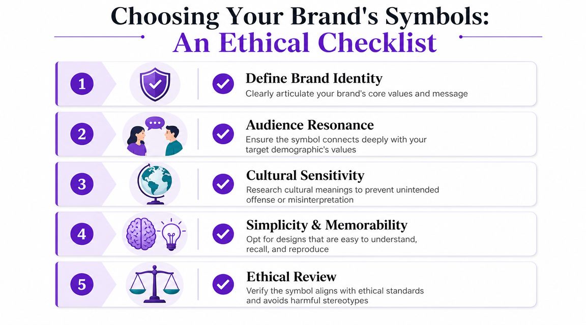
Before anyone opens Figma or sketches logo directions, get precise about what the brand needs to mean.
Ask:
Once you define those boundaries, symbol selection becomes easier. Without them, teams end up choosing visuals they personally like rather than visuals that communicate well.
A practical review process keeps symbols from drifting into guesswork.
Identity fit
The symbol should reinforce your actual value proposition. If you're selling legal precision, childlike doodles may dilute authority.
Audience resonance
A symbol has to connect with the people you're trying to attract, not just impress your internal team.
Cultural reading
Check regional meanings, subcultural associations, religious sensitivities, and political overlap.
Simplicity
If the symbol only works when enlarged and explained, it won't travel well across digital placements.
Ethical review
Make sure you're not borrowing sacred, marginalized, or culturally loaded imagery in a shallow way.
If a symbol needs a long defense in the conference room, it will probably struggle in the market.
Ethical mistakes usually aren't caused by bad intentions. They're caused by shallow research and speed.
The pattern often looks like this:
These failures are expensive even when no one planned them. They create friction, distract from the offer, and force the brand into explanation mode.
Seasoned teams do a few things differently:
A useful symbol should be flexible enough to travel but stable enough to accumulate meaning. That balance is harder than it sounds. Too rigid, and it can't adapt. Too loose, and it stops being an asset.
The hardest question around symbols in advertising now isn't whether they mattered historically. It's whether they still perform in short-form, algorithm-driven feeds.
That question matters because rapid-scrolling platforms reward immediate comprehension. As noted in this short-form symbolism explainer, brands need to test which symbols still read at thumbnail size and which need supporting text or motion cues. That's the right frame. Don't assume timeless brand assets automatically survive modern placement.
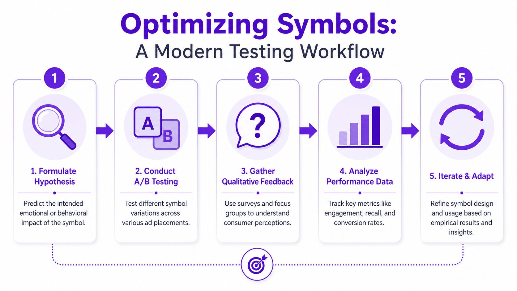
For most creators and small teams, the goal isn't a massive research study. It's disciplined iteration.
If you want a practical refresher on experiment design, this guide on boosting growth with A/B testing is a useful companion for structuring cleaner comparisons.
In my experience, three categories tend to travel well into reels, shorts, and mobile-first placements:
What often fails is subtle symbolism that depends on lingering attention. Intricate metaphor, delicate detail, and layered hidden meanings may still work in packaging, websites, or long-form brand films. In feeds, they often collapse.
For teams building repeatable workflows across channels, strong testing gets easier when the content system itself supports rapid iteration, repurposing, and format-specific creative decisions. That's one reason it's worth exploring how AI for social media marketing can support faster creative adaptation without losing consistency.
If you're turning long-form videos into shorts, thumbnails, captions, blogs, and platform-ready posts, Taja AI helps you scale that workflow without losing brand consistency. It repurposes one upload into ready-to-publish assets, supports brand templates and thumbnail generation, and helps teams keep symbolic cues consistent across channels while moving faster. Start free and build a content system that compounds.


We are blessed to work with leading brands & Companies


We try to make easy and simple for every professionals. Get 30 days free trial - No credit card required.


© 2025 Taja AI. All rights reserved.